How To Recreate This Italian-Inspired Living Space
What was the brief for this room?
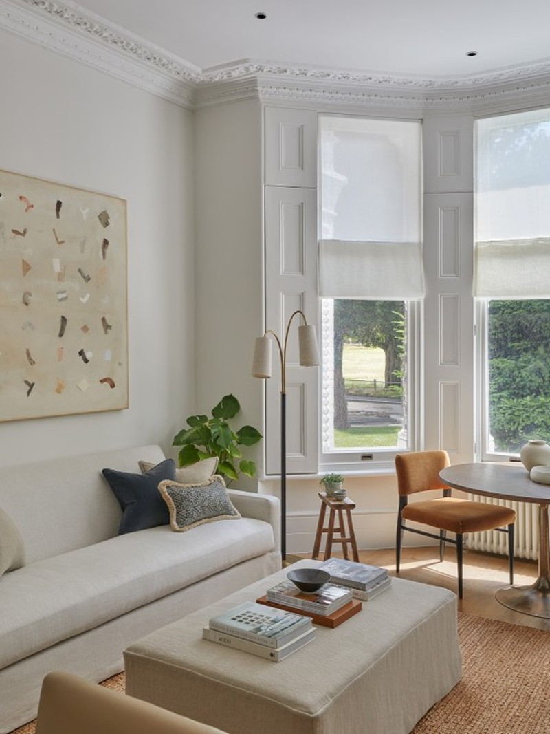
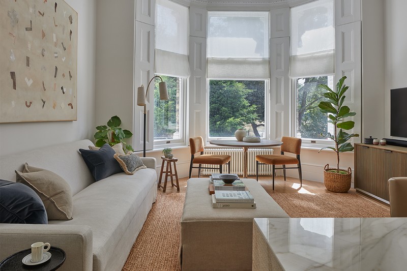
I wanted a calm and bright living room which maximised the property’s architectural heritage and highlighted the elegant high ceilings and period details. I think we managed to achieve a relaxed yet sophisticated scheme with a few rustic elements thrown in.
How do you use the space and how did you zone it?
This space works as a multifunctional living/dining space. The dining area is next to the bay window to make the most of the light and views across the common, and the seating area is in the main part of the room. We use this room to relax after a busy day, but the open-plan layout also works well for socialising and entertaining.
What inspired the colour palette?
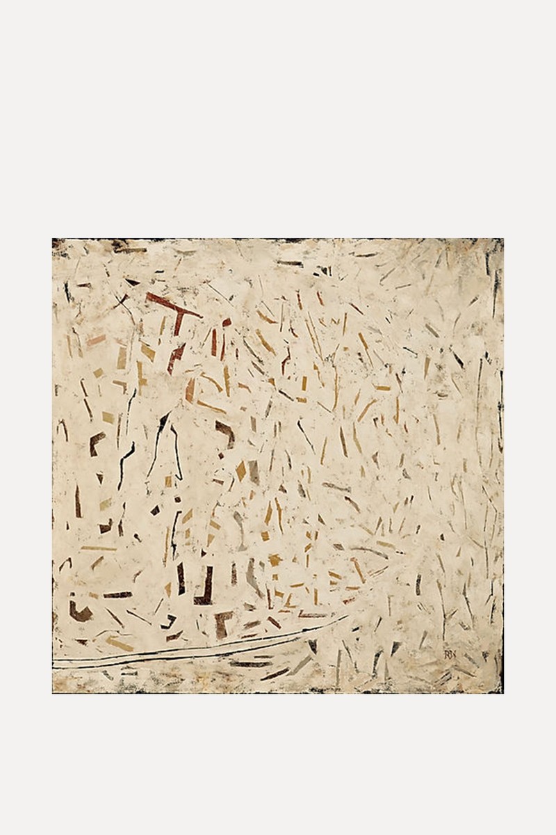
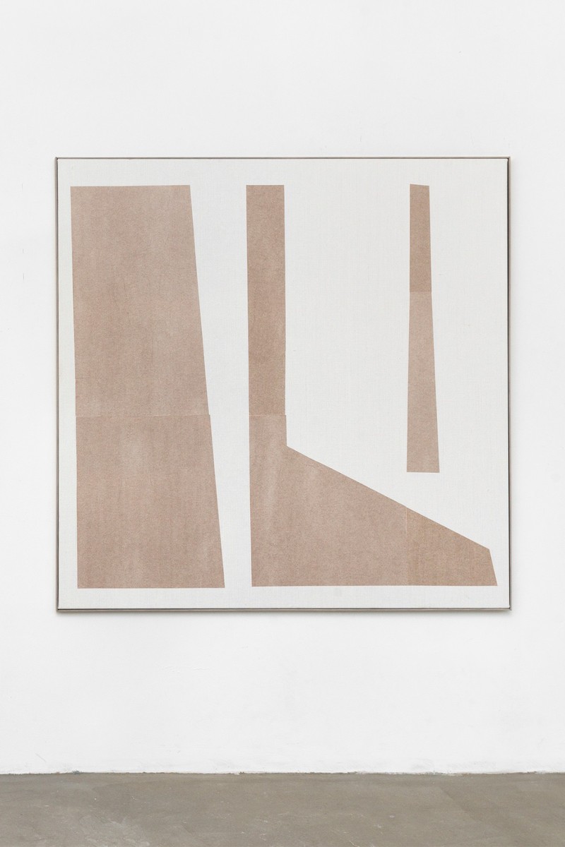
The colour palette is very calm, with neutral textured linens, tan and petrol blue accents, and carefully chosen contemporary furniture to give a relaxed and organic feel. The walls are painted in a subtle warm white, creating a restful, neutral backdrop. I wanted to create a timeless look but with some rustic touches, as a nod to my Tuscan heritage. The painting above the sofa, ‘Fragments’ by Richard Nott, also reflects the colour palette, with its gentle shapes and natural colours.
Why did you keep the curtains so simple?
To maximise the bay window’s natural light, I specified Chase Erwin’s linen blend Apsara Pearl to make up roman blinds to accompany the shutters. The fabric is heavy enough for privacy, but without obstructing natural light. This adds quiet character and subtlety to the room, keeping the look minimalist but with a sense of understated luxury. I didn’t want to over-dress the bay window because the period features – such as the shutters and architraves – are beautiful.
What’s the secret to combining period features and contemporary furniture?
I believe you need to have a certain sensibility in the pieces you choose for each project, and you need to ensure that each piece speaks to the architecture of the building. I like to source and design pieces that look as though they would have been there years before. It is a very delicate balancing act.
Inspired?
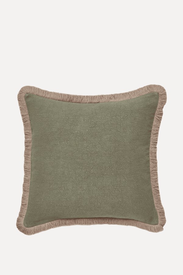
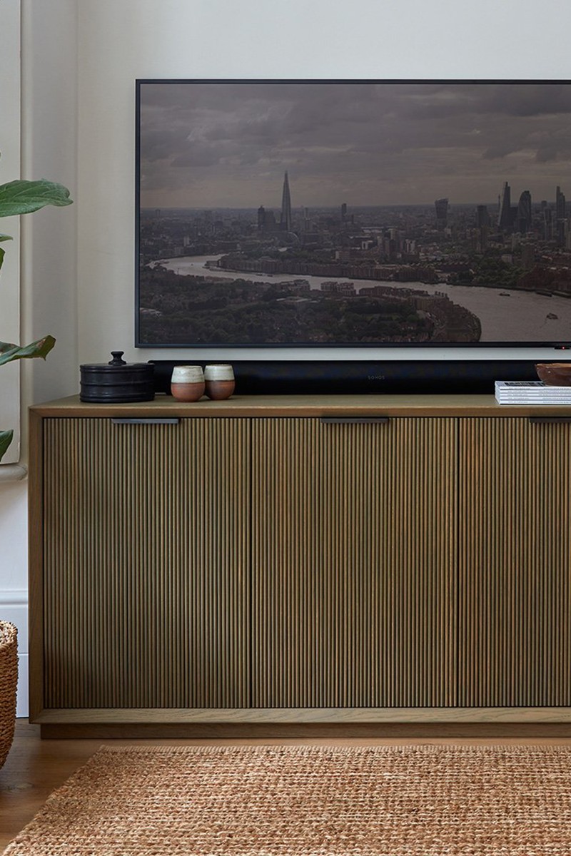
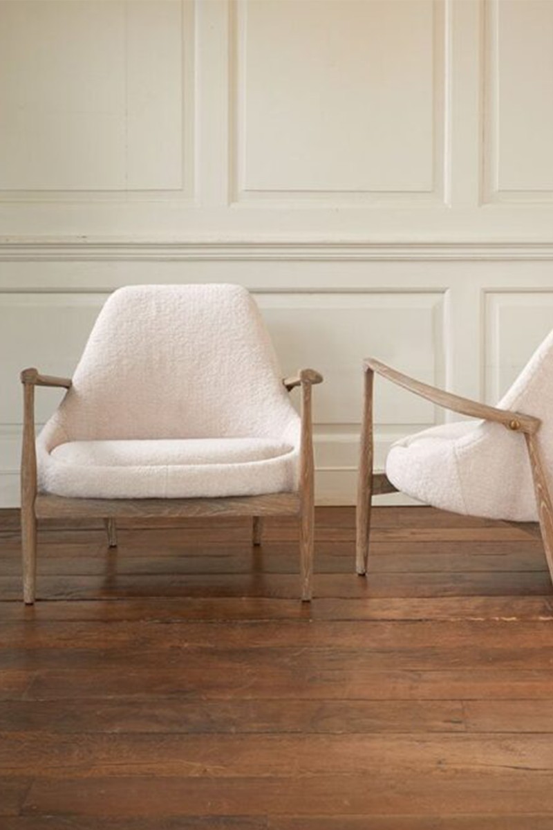
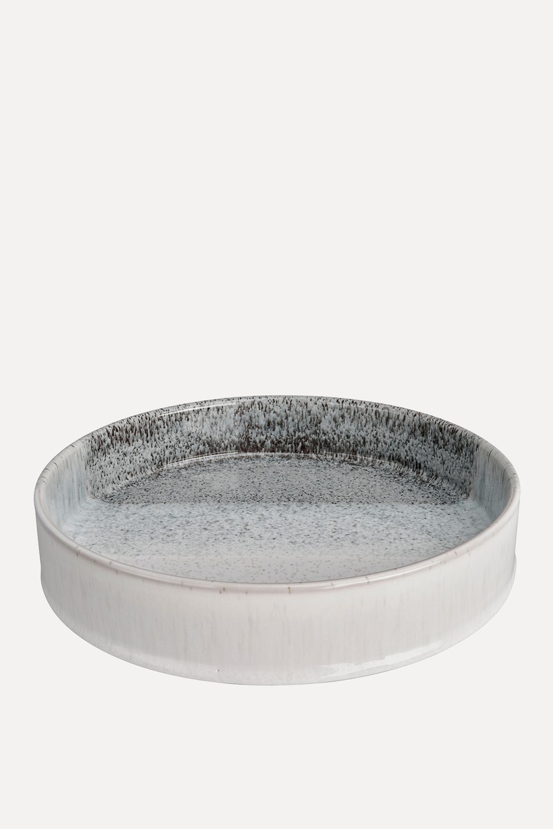
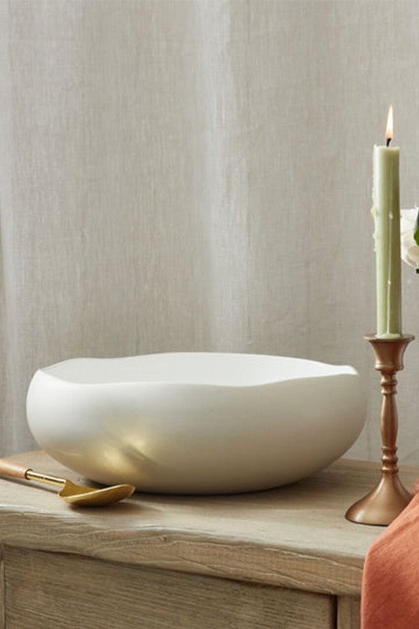
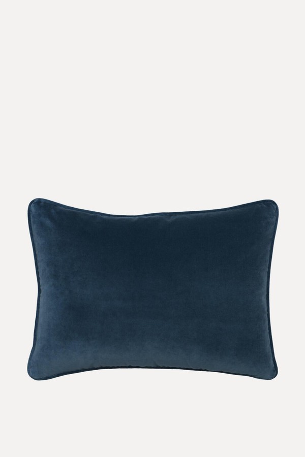
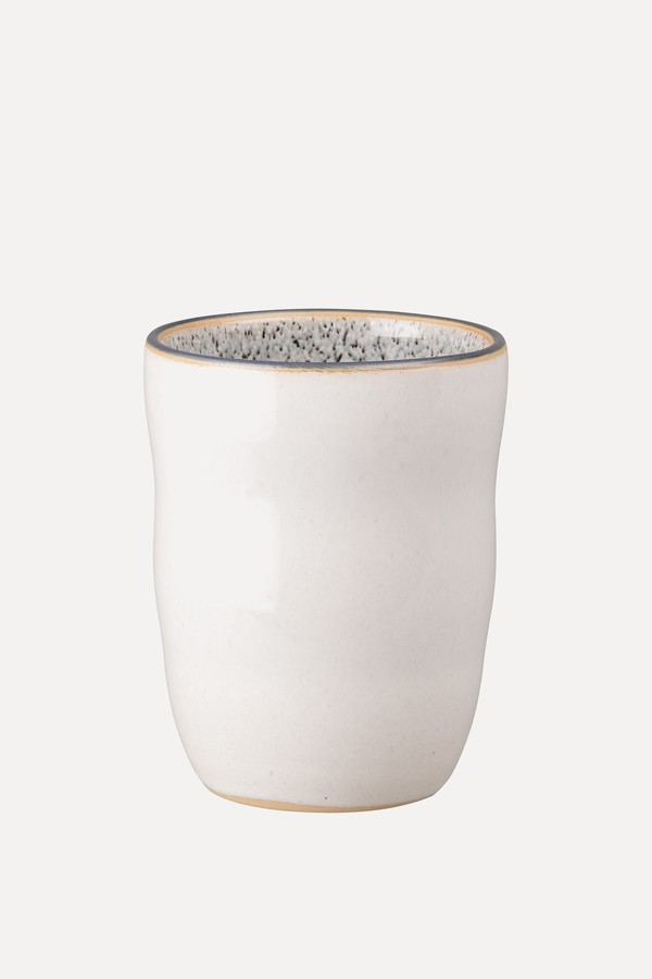
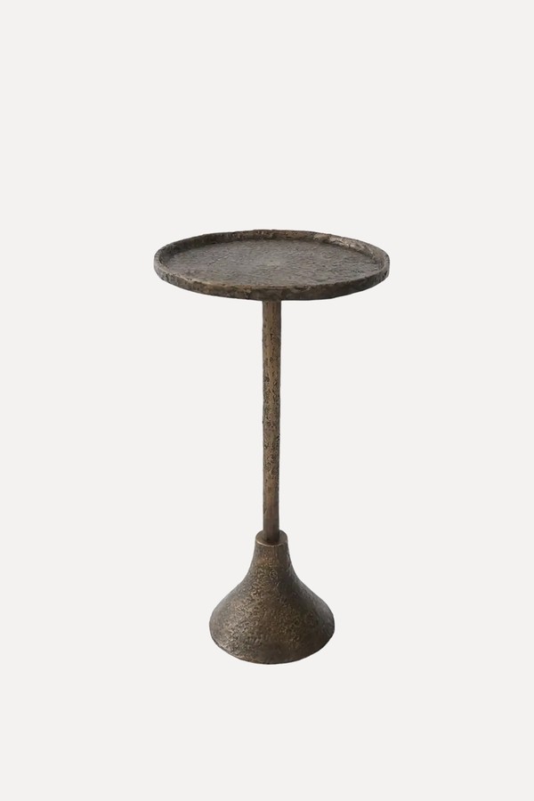
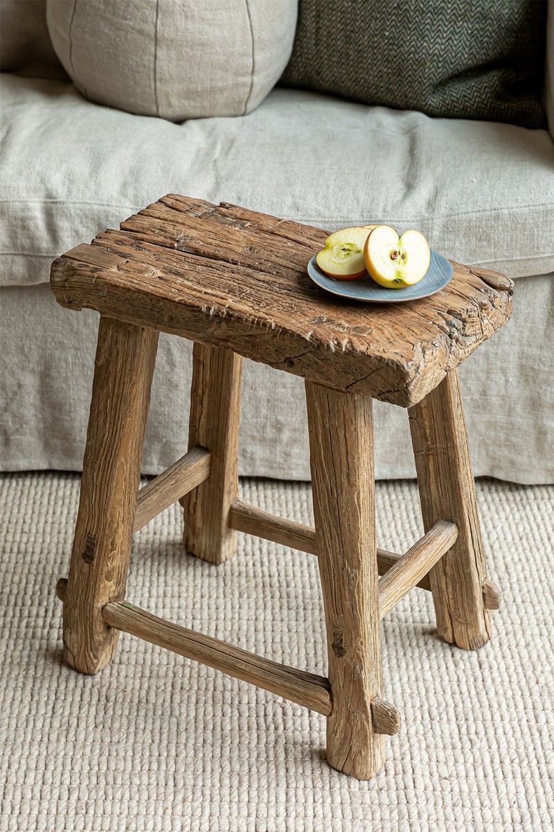
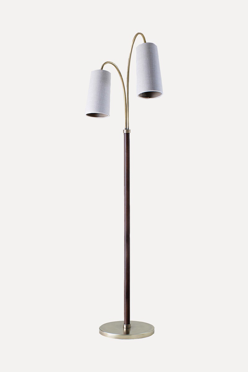
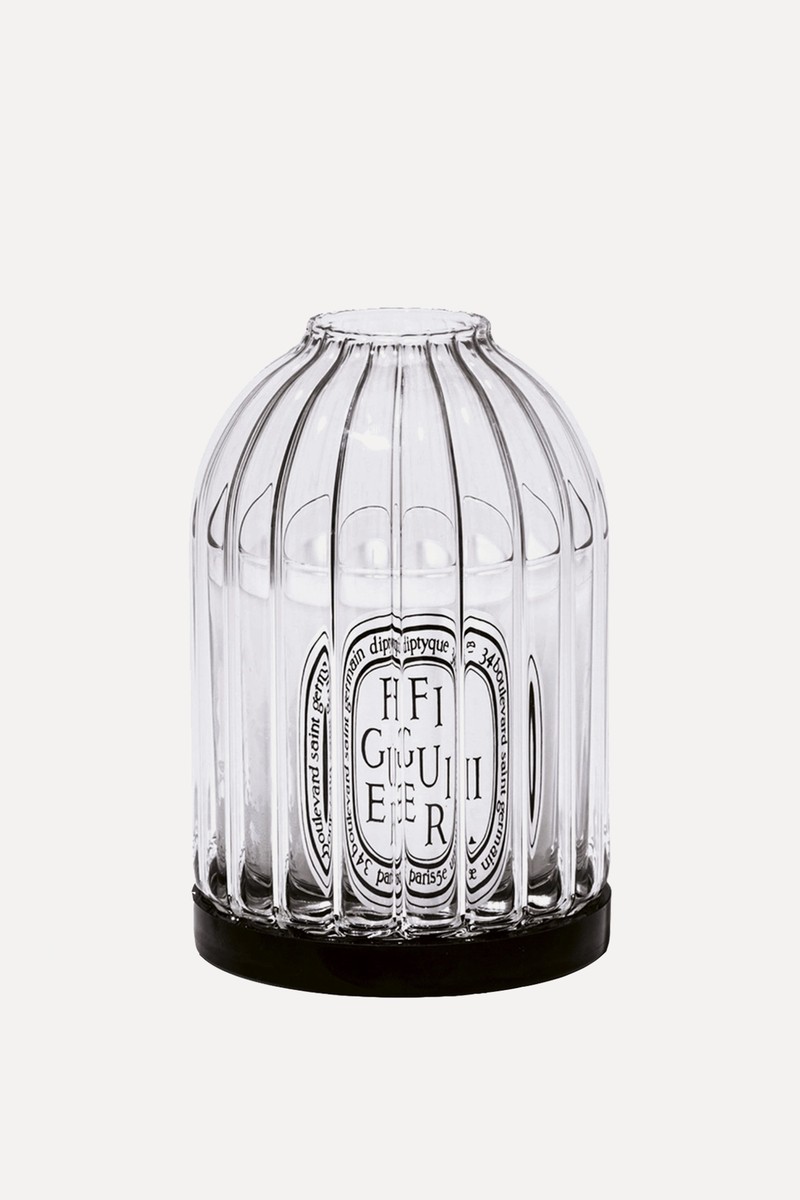
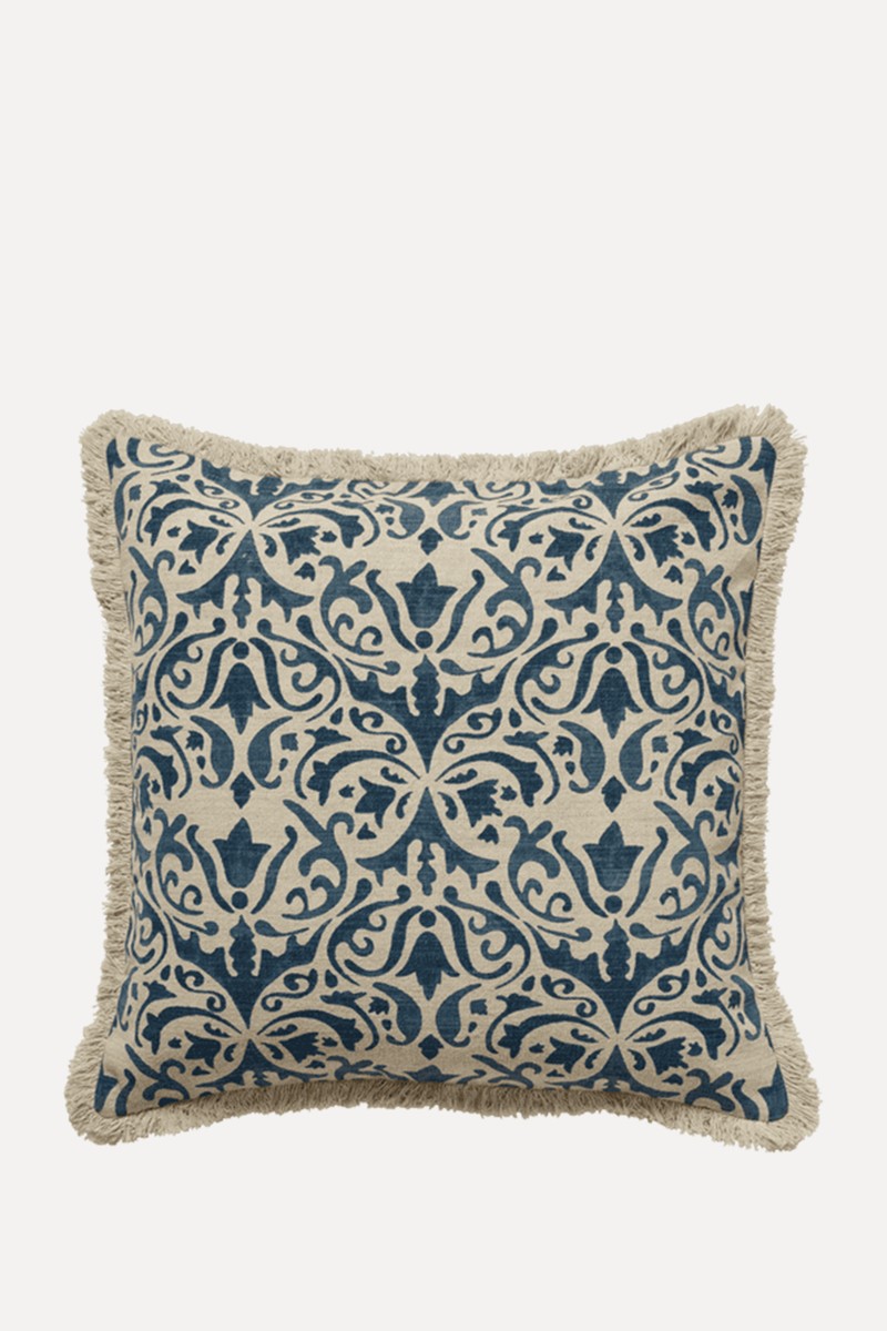
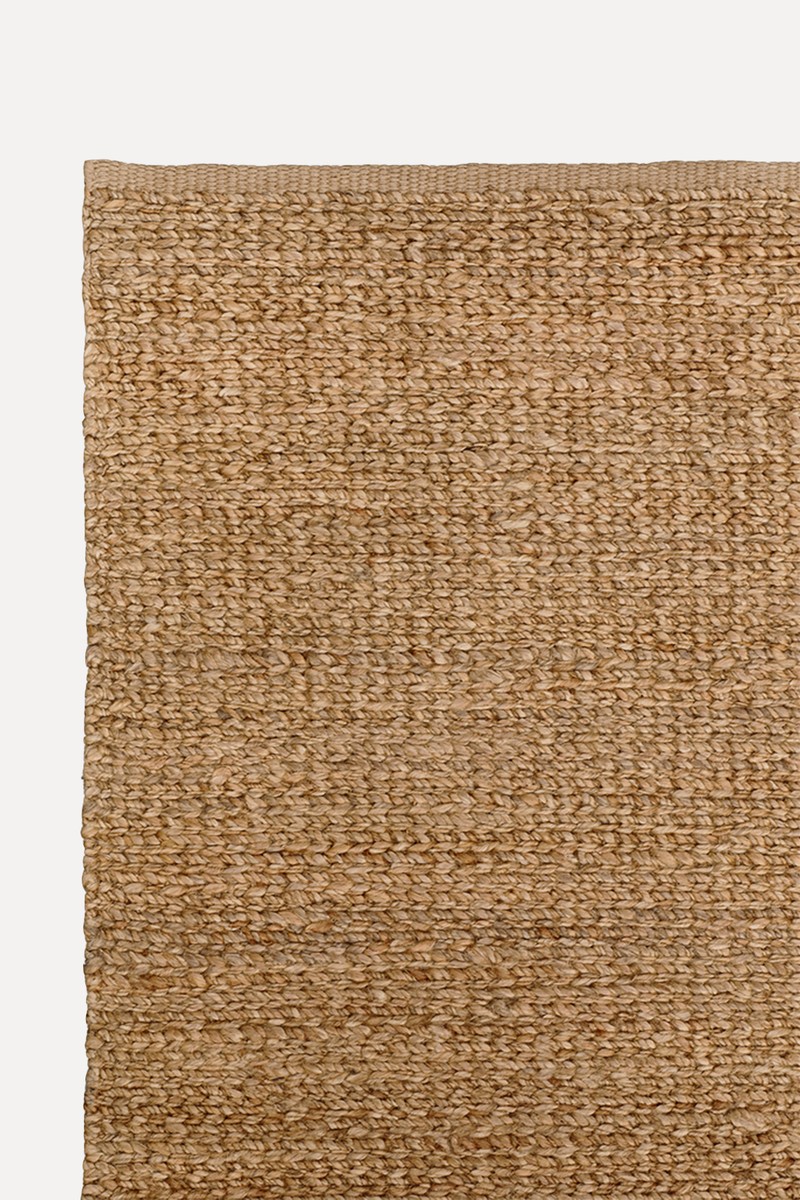
Shop The Edit
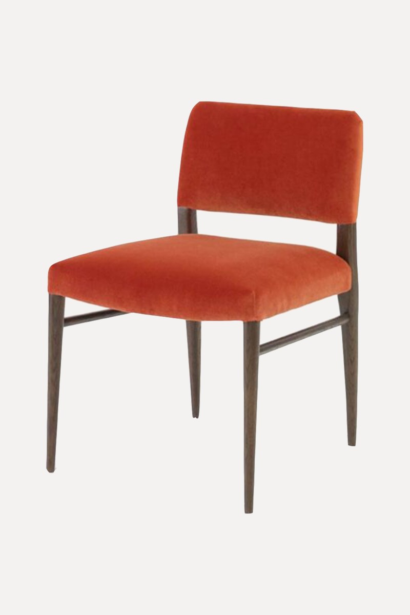


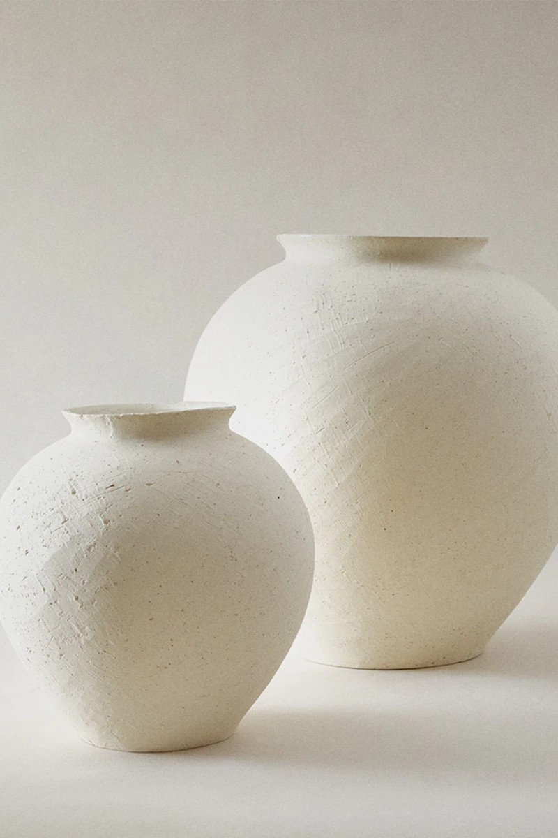
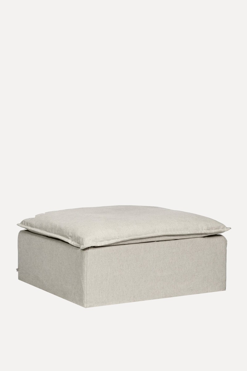
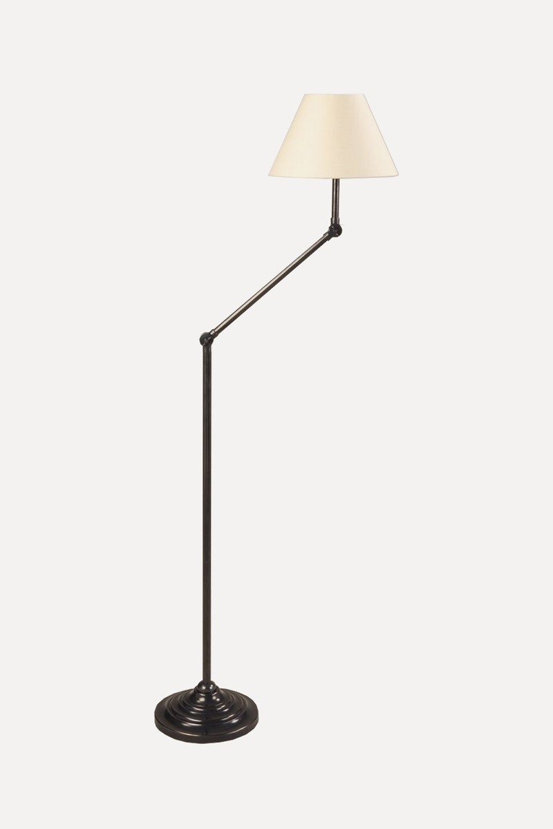



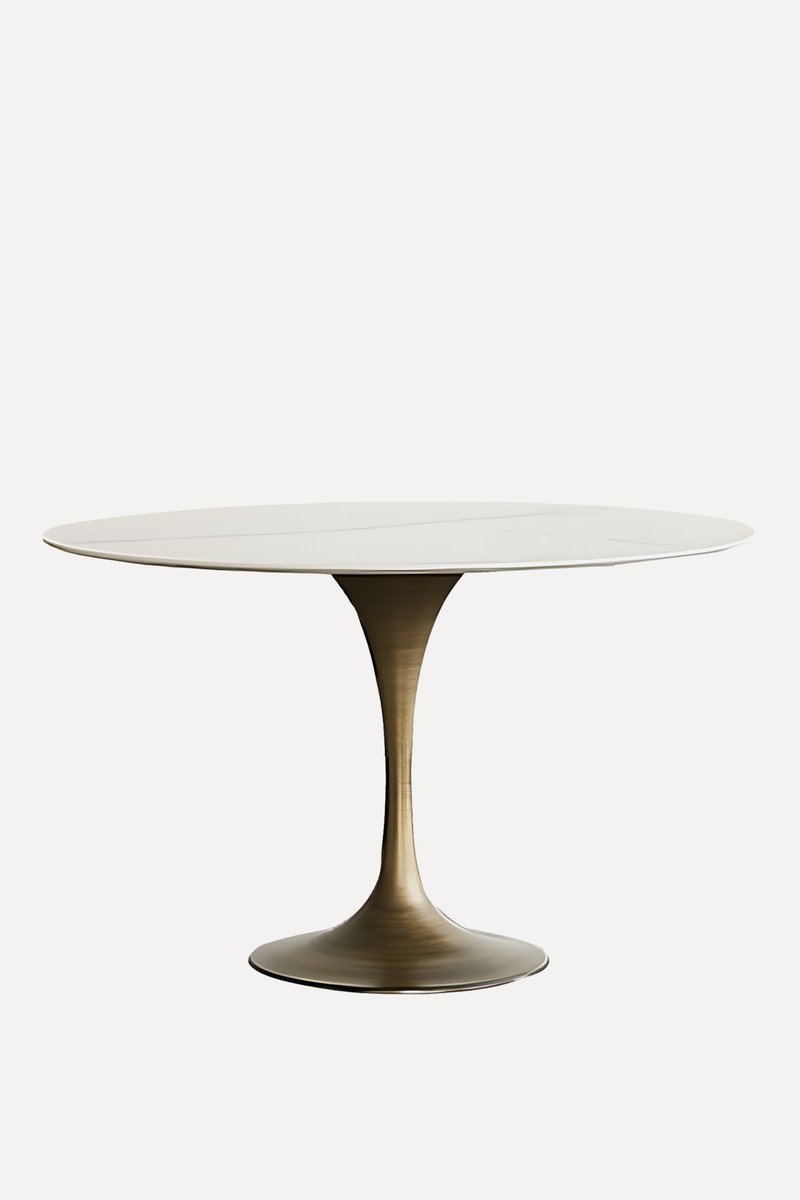
Litfad,

Visit AndreaBenedettini.com
DISCLAIMER: We endeavour to always credit the correct original source of every image we use. If you think a credit may be incorrect, please contact us at info@sheerluxe.com.
