
3 Stylish Kitchens To Inspire You
Jessica Summer
Interior Designer
The inspiration for this kitchen started with the soft pink hues often seen on rendered walls and terracotta floors in the Mediterranean, particularly in Mallorca – a place that holds special meaning for my clients. This informed the material palette from the outset: we developed a bespoke pink specialist paint finish, sourced reclaimed terracotta tiles for the flooring and stripped the existing wooden doors and windows of their lacquer to reveal the pale, raw beauty of the original pine. These textures and colours were the key to creating a warm, earthy and softly tactile atmosphere.
It was also important to respect the home’s Victorian origins so we carefully reinstated the architectural detailing to root the space in its historical context. I wasn’t trying to recreate a Mediterranean villa, but rather to let that influence inform the palette and materials in a subtle, authentic way.
In contrast to the organic and textured materials, the cabinetry and fittings are minimal and crisp. This juxtaposition of contemporary simplicity with natural texture is what I hope achieves a timeless look. The artwork – a series of bold, monochrome pieces – introduces graphic contrast, adding another layer of visual interest.
The kitchen had a U-shaped footprint to work within, which provided ample counter space and storage. I began with the oven and extractor, positioning them centrally on the back wall to anchor the space. From there, the layout came together intuitively. I always look for symmetry and balance in cabinetry, and this plan allowed for that without compromising functionality, like the two large drawers flanking the oven, giving visual parity while keeping essentials close to hand.
The sink sits beneath a window overlooking a long garden – always a lovely set-up – and it allowed me to align the sink, bin and dishwasher in one run. That’s a bit of a hard rule for me in kitchen planning.
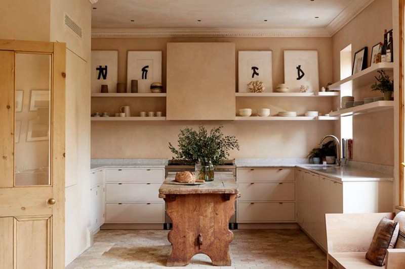
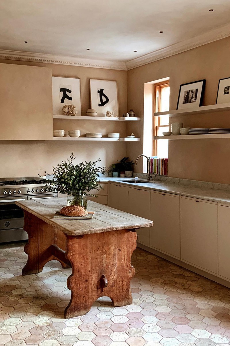
I am interested in how materials age. It’s important to me to know what I put in now will stand the test of time – natural materials will mark and patina but develop character and beauty. The floor is textured, with a variation of colour that is actually very practical for a kitchen. The carrara marble worktop was chosen partially because it’s such a classic stone and goes with everything (a bit like having a great white shirt) and also because there is a large original fire surround on the dining end of the room, also in carrara.
The lighting is very simple and minimal. We toyed with the idea of having pendants but in the end didn’t want anything interrupting the space, so we used downlight from Phos – the best I have found because they have a curved soffit, in antique brass. The shelves have a concealed LED strip in them for task lighting – it glows nicely at night as well. There are two spots placed close together over the dining table, on their own circuit, and a floor lamp – so for an evening dinner, this offers soft ambient lighting.
This is a unique kitchen because it’s not really about the kitchen. The kitchen itself has plain fronted cabinets, painted in a pale colour and tonal to the walls, and it’s secondary in a room that has integrity in its architectural details and the view of a long, verdant garden beyond. One of my favourite elements is the old farmhouse table I found, used as an island. I like kitchens to feel furnished and not like a fitted kitchen with lots of matching elements.
Visit JESSICASUMMER.CO.UK
Annie Burrows
Lead Designer, Blakes London
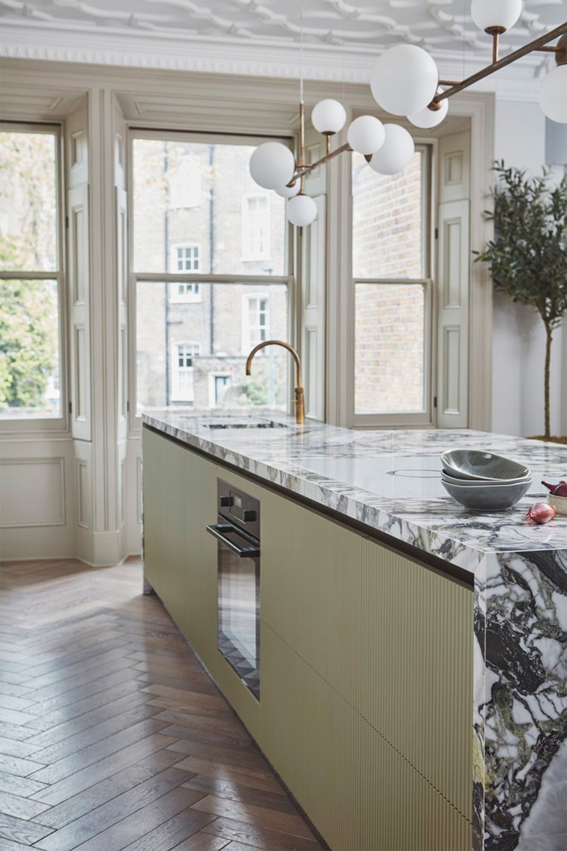
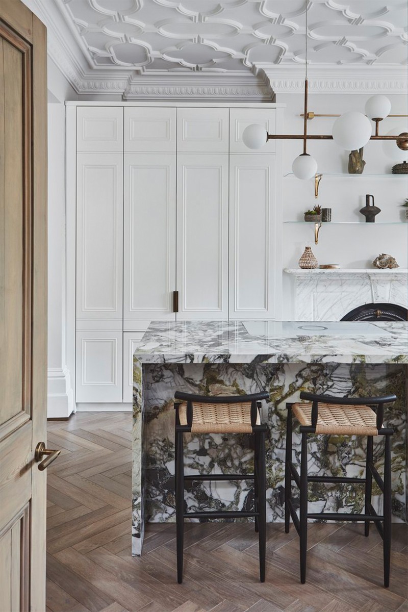
The primary inspiration for this kitchen came from the architecture itself. Housed within a Grade II-listed gothic revival home, designed by John Johnson of Alexandra Palace fame, the space demanded a sensitive and respectful approach. The client was keen to avoid pastiche, so our challenge was to weave the kitchen seamlessly into the grandeur of the upper ground-floor reception room without overwhelming its original features. Retaining the ornate ceiling panelling, original timber shutters, and marble fireplace provided a beautifully rich foundation upon which we could build a scheme that felt both contemporary and rooted in history.
The layout was driven by the proportions of the room. It’s a long, narrow space, which wouldn’t comfortably accommodate a traditional dining arrangement. Relocating the kitchen here allowed us to reimagine it entirely. The oversized green marble island became the anchor, centred within the room to enhance flow and make use of the natural symmetry. By integrating a sumptuous, vegan-friendly banquette, we created a relaxed dining area that’s family friendly without encroaching on valuable circulation space.
Material selection was particularly considered. The large-format porcelain tile mimics verde marble but offers wipe-clean practicality, ideal for a home with young children. The moss green, gently fluted island cabinetry introduces tactility and softness, balancing the crisp edges of the monolithic worktop. Chalky, muted cabinetry paints from Annie Sloan create a light, layered palette that enhances the airy elegance of the space, while smoked elm interiors bring warmth and richness when the doors are open.
Lighting was thoughtfully designed to balance both mood and functionality within the expansive open-plan space. A layered approach was taken, beginning with statement pendants suspended over the island – set on dimmer switches, they provide sculptural interest as well as adaptable task and ambient lighting. These are complemented by discrete directional spotlights, hanging subtly from the ornate ceiling cornicing. This careful integration introduces a contemporary contrast without disrupting the heritage plasterwork. To complete the scheme, a slim brass LED track light is positioned above the shelving unit, casting a warm, gentle wash down the wall in the evening.
Given that this kitchen is housed in a listed historic building, it was key that the space respected the bones of the home. One of my favourite aspects of the design is how it almost disguises itself as a kitchen. The tall cabinetry, with its simple recessed panels, echoes traditional living room joinery, and the appliance garage, fridge and freezer are all hidden out of site. The shelving above the original fireplace blurs the line between function and decoration, allowing a curated display of art, greenery and ceramics to draw the eye upward and across, creating a space that’s both refined and welcoming.
Visit BLAKESLONDON.COM
/https%3A%2F%2Fsw18.sheerluxe.com%2Fsites%2Fsheerluxe%2Ffiles%2Farticles%2F2025%2F04%2Fsl-220425-the-kitchens-we-love-house-nine.jpg)
Jojo Barr
House Nine
The kitchen design for this Edwardian home was very much led by the homeowner’s vibrant personality – and the desire to create a space that felt both sociable and characterful. We reimagined the entire footprint, creating a rear prep kitchen and a front kitchen designed for entertaining, complete with a bar area for guests. The client’s playful energy gave us freedom to be bold with colour and bring in fun, unexpected details, which really brought the space to life.
Functionality was key, which is why we separated the space into two distinct zones: a practical rear prep kitchen and a front-facing kitchen where people could gather, cook and enjoy a drink at the bar. To connect the kitchen and dining area, we opened up the wall with two stunning arches, incorporating a fireplace in between. It’s a layout that works beautifully for hosting but still feels warm and intimate – a balance of practicality and personality.
We wanted the materials to add contrast, character and warmth. The bar area features a moody, dark green finish using our House Nine x COAT Rocky paint, paired with an antique brass worktop which will beautifully patina over time. In contrast, the breakfast kitchen has a more traditional feel, with lighter cabinetry and a classic butler’s sink. Here, we used dark granite countertops to tie the two spaces together and bring in depth. Throughout, we layered in detail, from standout hardware and reeded glass to our House Nine x Chaunceys Buttered Toast flooring and antique runner rugs which creates a tactile, lived-in feel that still feels cohesive and considered.
Lighting was a huge part of the brief. Our client was very clear about wanting to create a soft, atmospheric glow. We used antique prismatic pendant lights, ceramic shades and soft flush mounts, carefully layering different types of lighting throughout the space. Antique pendants over the bar and opal-shaded lights above the shelving provide warmth and character, while wall lights on separate circuits and dimmers allow the mood to be dialled up or down. It means the kitchen feels just as comfortable for slow mornings as it does for hosting a party.
It’s quite rare to have a kitchen with distinct yet complementary zones – a moody and sociable bar area, and a softer breakfast kitchen which work in harmony. That, for me, is what really sets this space apart. We also had a lot of fun with the details such as the arched dog bed integrated into the cabinetry, which is a real showstopper, and the bespoke butcher’s block brings such a sense of history and craftsmanship. Every element was chosen to reflect the client’s personality and the way they use their space to host, entertain and live.
Visit HOUSENINE.CO.UK
DISCLAIMER: We endeavour to always credit the correct original source of every image we use. If you think a credit may be incorrect, please contact us at info@sheerluxe.com.
/https%3A%2F%2Fsw18.sheerluxe.com%2Fsites%2Fsheerluxe%2Ffiles%2Fwebsite-images%2F2025%2F03%2Fsign-up-pop-up.jpg)
