19 Tips From A Top Interior Designer
STYLE AND INSPIRATION
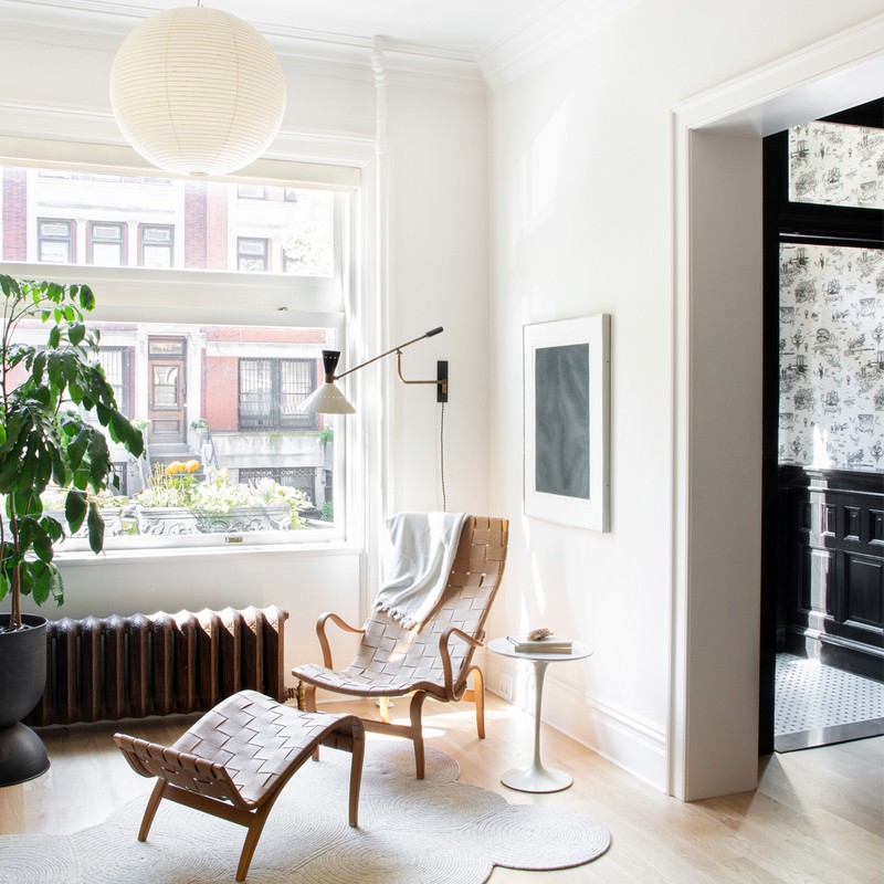
I’d define my style as modern, eclectic, layered and planet-aware. My design ethos is that thoughtful design contributes to, and enhances, our overall wellbeing.
I have favourite elements in all my projects. However, at a push, I’d pick both our 8th Street Townhouse and Charles Street projects. The former was a period brownstone in Brooklyn where we partnered with an architect to bring it to life, and the latter was a new one-level condo in the West Village in Manhattan which we worked with the contractor on, directly.
I gravitate toward neutrals as the backdrop to most spaces, but recently the warmer variety. Some of my go-tos are Farrow & Ball Purbeck Stone, Ammonite and Elephant’s Breath for tonally balanced greys. I'm currently really loving the depth and quality of Farrow & Ball’s new colour Jitney and Atelier Ellis’s Stony Plaster for a soft and subtle hint of pink, too.
I love designing children’s rooms. They allow me to think a little differently and with a more playful and whimsical hat on. They usually have to be more multi-functional and transitional than a typical room in a residential environment. Children change and evolve so quickly and, as a result, their rooms have to have a versatility other areas in the house don’t. They also push me to use colour and pattern in a way I otherwise wouldn’t, which is fun.
Since moving back to London, I have found the simplicity of the British countryside boosts my creative soul; the freshness of the air, the abundance of foliage, the colours, the social interactions of those living a slower and more connected way of life. It’s all so invigorating and inspiring.
For timeless, classic interiors, I’ve long loved the work of Vincent Van Duysen and Axel Vervoodt. For something more current and layered, look to Decus Interiors, Templeton Architecture and Ashe Leandro. I also enjoy looking at work which is a little different. It’s so easy to get consumed and not keep an eye on what’s going on in the market. For that, I look to the slightly more traditional work of people like Brian Paquette, Rose Uniacke and Disc Interiors.
Instagram really inspires me. I recently shot a project with Sarah Elliott and I have since become obsessed with her work and the people she collaborates with. I also love Rebecca Wakefield’s stories; she’s a friend and fellow London designer who gives it to you straight with a very care-free, honest approach, which I love. The Modern House is a very aesthetically pleasing way to keep your eye on the UK property market and photographer Genevieve Lutkin’s feed is beautifully sensitive and inspiring.

PLANNING
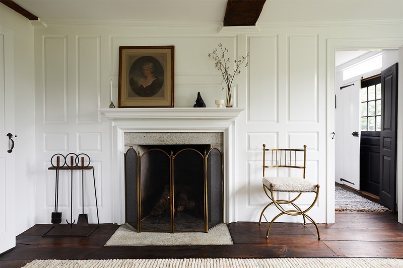
When I start designing a room, I always survey the space and take detailed measurements of all existing architectural elements so I know exactly what I’m working with.
To enhance a small space, invest in lighting, window treatments and sofas. Adding curtains or roman shades can transform a room, as can sculptural lighting that provides the right distribution and level of illumination. Sofas are a no-brainer since they are typically one of the most used items in a house after a mattress and a kitchen.
In a large open-plan room, it’s all about creating clearly defined zones with furniture and textiles. Space planning and furniture layouts are crucial to the success of this process, and rugs, lighting and storage pieces go a long way to provide division, separation and definition.

DECORATING
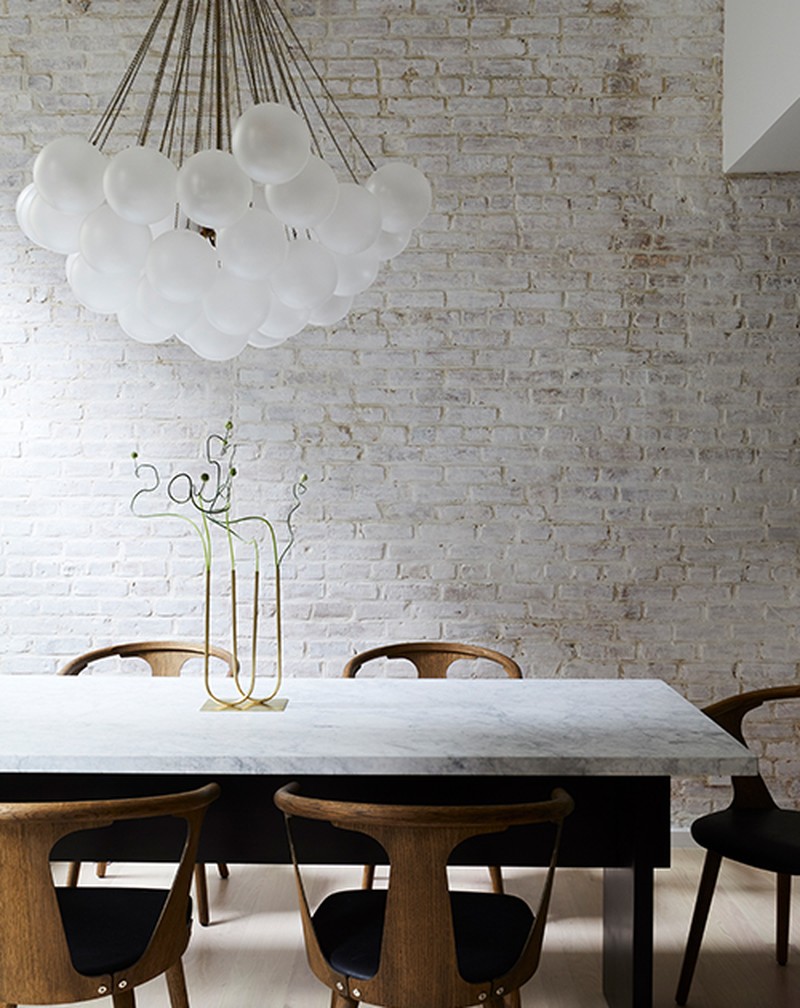
When creating a colour scheme or mood board, I always dig into the external environment surrounding the property, the lifestyle of the client and the architecture of the home. That usually starts to inform the colour palette, as well as form and materials, which then allows us to start thinking about shapes, proportions and styles. If we’re talking about a single room, I would use one colour on the walls only but I might enhance smaller architectural details with tonal shifts.
I like mixing patterns, but scale is important. A variety of sizes allows each pattern to breathe. Depending on the type and size of a room, the number of patterns I might have in a space varies. For example, I like keeping them to a maximum of two in a powder room, and this includes any pattern or movement there might be in a stone. For a larger living area, there could be as many as five or six, including throw pillows and blankets.
If you’re taking an eclectic approach with furniture, make sure it’s unified by the colour palette. If you mix genres, patterns and colours, you risk creating a space that feels more chaotic than calming.
I try hard to steer clear of trends so that designs have longevity, but I have been encouraged by the spotlight on planet-friendly design and natural materials. My only advice is nothing stands on its own. Everything should have a relationship to something else and there should be an overall element unifying everything. I encourage people to buy what they love and what they think they will keep for years, so long as it has a purpose and a connection to other aesthetic elements of the room.
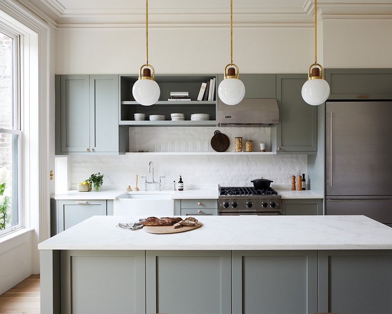
Functionality is the most important thing to consider when designing a kitchen. For flooring, I love wood and limestone for kitchens but it depends how brave you are. I never suggest using toxic finishes on any material and so, if you’re a messy cook who is prone to spills, wood flooring probably isn’t the best idea. Limestone is a natural material that tends to be very durable, cost-effective and easy to maintain, so it’s a great option for those who have hesitations.
I almost always have a preference for marble worktops, though the UK market is definitely more nervous about this than the US. If that is too pricey or makes you anxious, limestone or quartzite are great, natural alternatives. I always prefer a natural stone to a porcelain or quartz. It also depends on the look you’re going for. I’ve used stainless steel countertops before which are very utilitarian and great for more avid cooks.
I always look at paint colours during the day in natural light. However, it’s important to get the right bulb temperature when selecting light fixtures because that can distort things. Going very warm or very cool is rarely a good idea.
Splurge on lighting, vintage pieces and save on occasional pieces, like side tables, secondary chairs and accessories. Finally, prioritise paint and lighting if you’re on a tight budget.
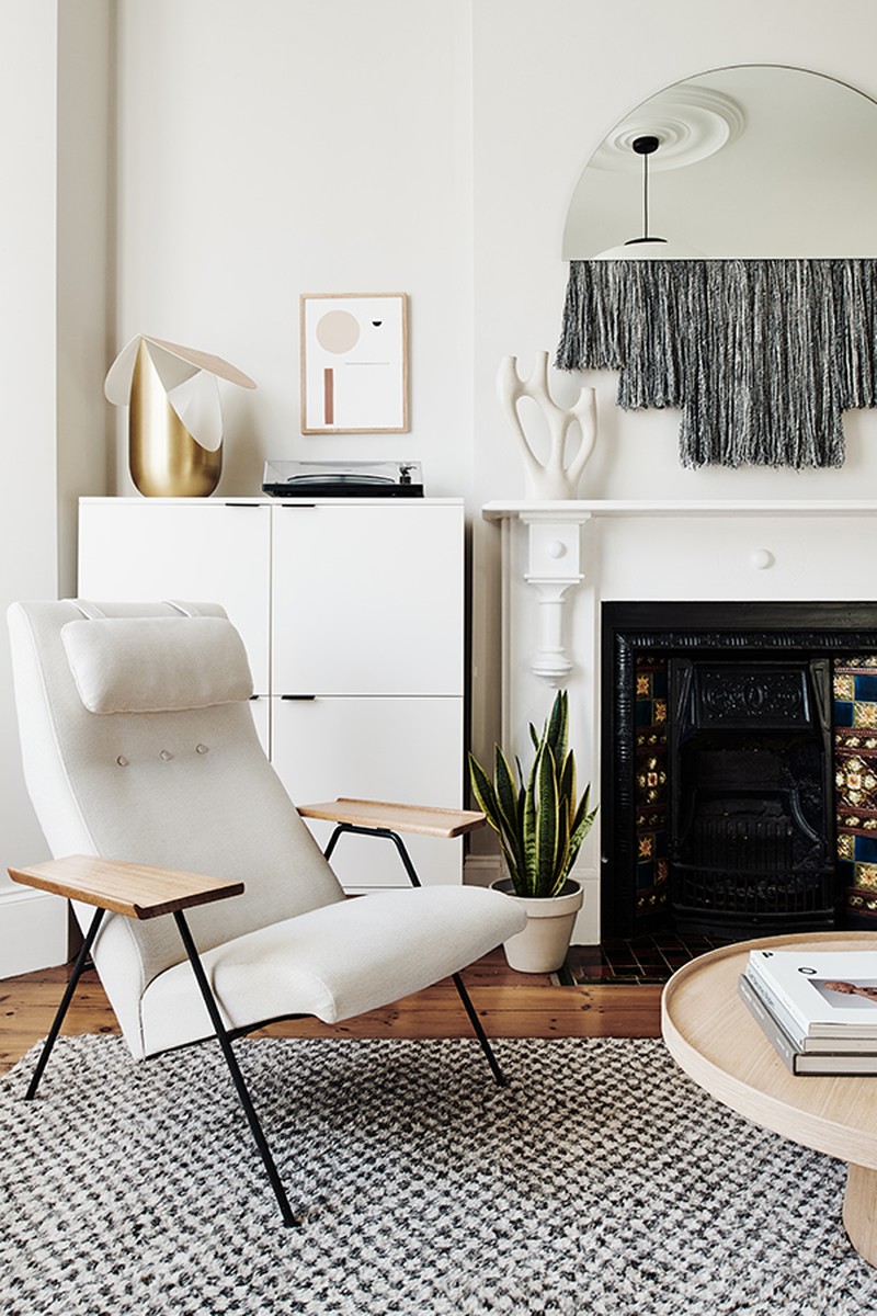
Where I go for…
Furniture:
Beton Brut
Another Country
Pinch
AU Bespoke
Fabrics:
Kvadrat
George Spencer Designs
The Cloth Shop
Joinery:
Fred Rigby
Studio Hako
Kitchens:
Life
Pluck
Bathrooms:
West One
EXT
Studio Ore
Wallpaper:
Juju Papers
Maison C
Paint:
Atelier Ellis
Farrow & Ball
Little Greene
Lighting:
Apparatus Studio
Allied Maker
Pamono
Vinterior
Astro
Flooring:
Horning
Dinesen
Chauncey’s
Tiles:
Claybrook
Mandarin Stone
Fired Earth
Kitchen Hardware:
D-Line
Pitella
Swarf
DISCLAIMER: We endeavour to always credit the correct original source of every image we use. If you think a credit may be incorrect, please contact us at info@sheerluxe.com.
