How To Make The Most Of A Small Kitchen
Assess Your Space & Plan Your Layout
No matter the size of your kitchen, there’s often a tendency to try and cram in as much as possible. “We encourage clients to avoid this,” explains Magnus Nielsen, leading designer at Blakes London. “Especially in smaller kitchens where space is limited. We advocate doing less but doing it well.” Interior designer Anna Hewitson agrees: “You have to be quite clever when designing a compact kitchen. First, make a list of your essential appliances – sink, fridge, cooker, dishwasher and bin. From there, think about the ergonomics – ideally you want your dishwasher and bin near the sink, with the cooker set some distance away to allow for decent prep space.”
Remember, when designing for the most diminutive of spaces some clever design solutions can help. “Include a pantry and tall cupboards for cooking equipment and large appliances, while retaining enough food preparation surface area by designing full height units in the corners of the room or at the end of a run of units,” suggests interior designer Henry Prideaux. “That way, the space in the middle can be fitted with low-level units with wall units above, allowing a decent proportion of countertops and space for a hob and sink. Corners can be tricky as you want to use every available inch, so clever pull-out solutions can work well.”
Keep The Units Streamlined
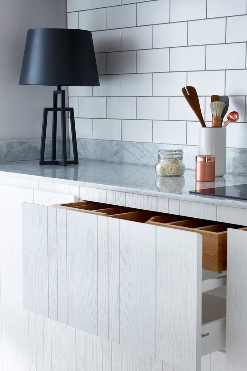
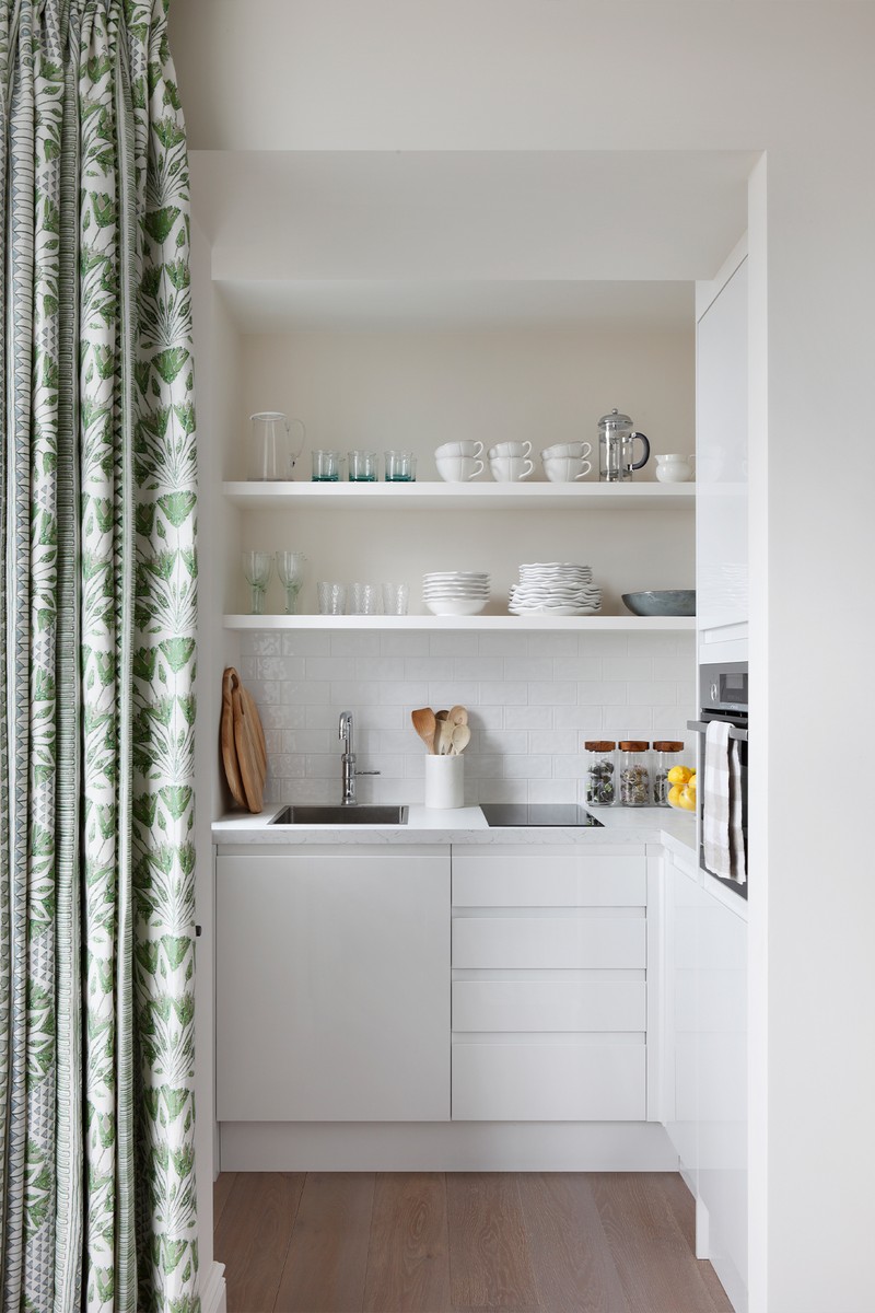
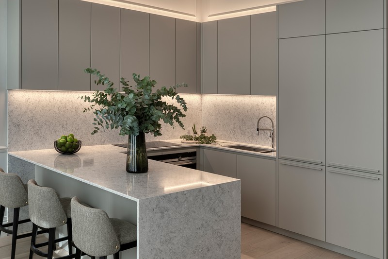
If you have a small kitchen, avoid clutter and overcomplicating it. “Keep it simple and clean throughout,” agrees interior designer Benji Lewis. “The use of simple plain fronted white units will evoke an uncomplicated look, which is going to help make things look more spacious, too. Also, handle-less door fronts and drawers are a good idea, as they have a streamlined, unfussy look to them – Siematic have some excellent styles which let other aspects of the kitchen do the talking. They also look good in traditional galley kitchens where you want to take a more modern approach.”
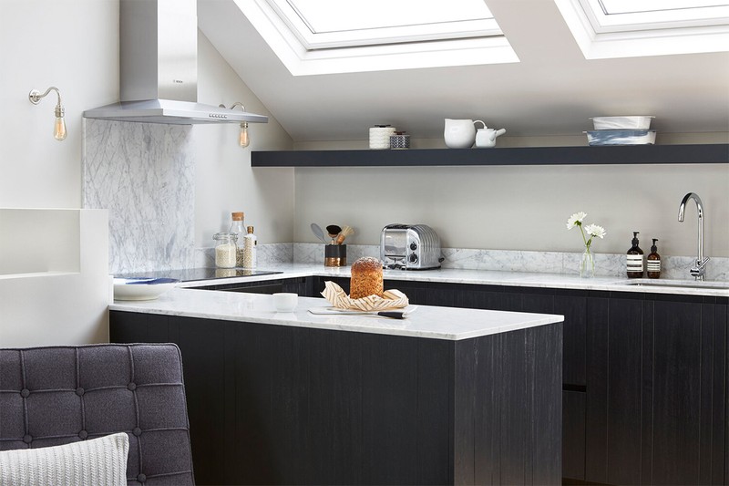
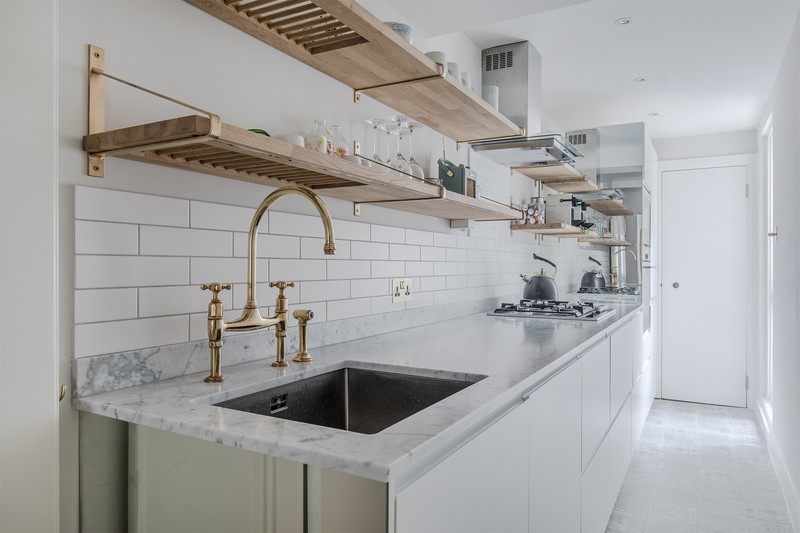
Creating a bank of cabinetry along one wall is a great way of streamlining and opening up the space, too. “Tall wall units are particularly suited to narrow, galley-style kitchens as using this space ensures the area feels less cramped,” explains Ben Burbidge from Burbidge & Son Kitchen Makers. “Avoid the temptation to compromise the proportions of cabinetry in order to fit more in, as it will often serve to further highlight the spatial challenge of a space,” adds Magnus. “Instead, think about how much storage you really need – after all, we're all guilty of having more mismatched mugs and glasses than we actually use. It may seem counterintuitive, but an open shelf rather than wall hung units can help make a space feel more spacious, too. Yes, there will be more dusting required, but it can be transformative.”
Be Meticulous With Storage
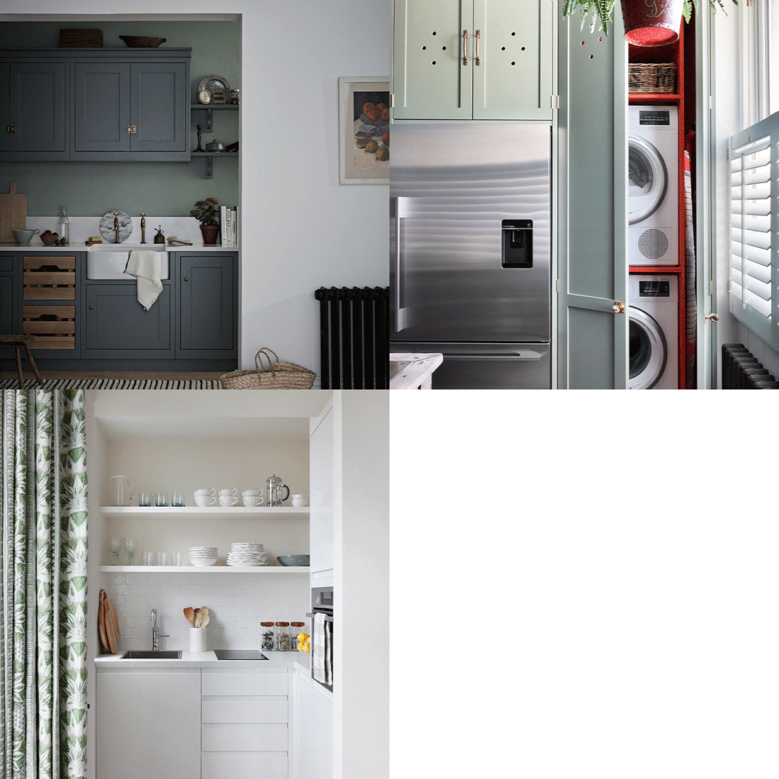
It may seem obvious, but storage, in all forms, is key when it comes to designing small spaces; if you don’t have good storage, then daily life becomes chaotic. “Having a decent cabinet maker who can turn every nook and cranny into storage for things like cookbooks, wine racks and spice shelves will be a worthwhile investment, but most kitchen companies, even at the lower end of the market, will have some clever design tricks up their sleeve to maximise even the smallest of spaces,” says Henry.
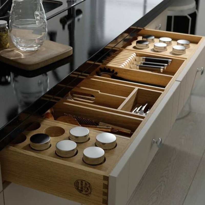
“Put as much thought into the interior organisation of the cupboards as you do the overall aesthetic, too,” says interior designer Katharine Pooley. “And remember, everything needs to be planned meticulously before you start construction. If everything has its place, nothing will be left on the counter to ruin the look of your new kitchen.”
Choose & Place Appliances Carefully
“Start by making a wish list of appliances and begin plotting them on your plan,” suggests interior designer Yoko Kloeden. “Some appliances are more versatile than others – for example, a microwave can be place either in a wall cabinet or a tall cabinet, while an oven can be either in a base cabinet or a tall cabinet – so be sure to consider all the options.”
When it comes to the layout, keep it simple and uncluttered; especially when it comes to surfaces. “Consider installing a boiling water tap, as it may take up space under the sink, but a clean, empty worktop is easier to maintain. You may wish to consider a combi microwave oven to save space, too,” says Magnus. Elsewhere, hide appliances away behind cabinets and under the counters, and consider concealing a neat washer and dryer vertically. Integrated appliances will also make the kitchen feel more streamlined – while a slimline dishwasher is the answer if the space is really tight.
Don’t Forget Lighting
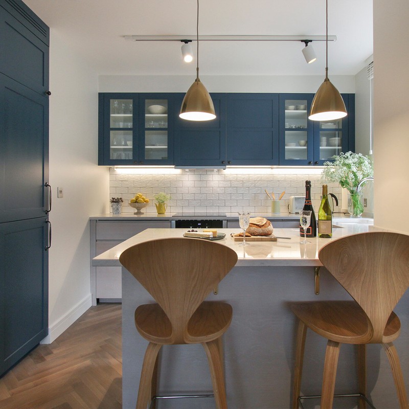
Planning your lighting is essential in small spaces, especially if you have limited natural light. “Task lights and pendants work particularly well above work surfaces to illuminate preparation areas but consider integrating lighting with dimmers throughout the rest of the space to allow you to adjust the light depending on the time of day and whether you are entertaining,” suggests Ben.
Meanwhile, layering decorative and functional lighting will ensure a balance of form and function – whether it’s a functional sconce above a sink or a decorative pendant hanging over your kitchen island. “If you love the look of pendants but are worried about making the space feel closed, opt for crystal or glass to achieve an airy and flowy feel,” says Megan Matharu from Visual Comfort Lighting. “When space is more limited, a flush mount is a great option from the vast category of ceiling lighting. Flush mounts can be large, medium, and small; they come in a vast range of styles from traditional to more decorative starbursts and other sculptural forms.”
Push The Budget On Materials
“The one advantage of a small space is you can consider splashing out on a nice worktop or statement tiles as you don’t have a big area to fill – and the same goes for handles,” says Anna. “Keep the finishes relatively simple, adding interest with one or two key elements, whether that’s the handles, tiles or worktop.”
“When choosing finishes and elements such as countertops, wall tiles and splashbacks, hardware, flooring, and lighting, spend time allocating your budget wisely and invest in quality, seeing a small kitchen as an opportunity to showcase the decorative details that reflect your style,” adds Henry.
Know That Neutrals Are Safe, But Bold Colours Can Work
Cupboard finishes and surfaces should form part of the same tonal narrative, as it will give an airy and considered feel to a space. Katharine explains: “For a recent project, I combined a soft grey paint finish with weathered oak cupboards. This timber features visible grain to add richness but tempers it with a soft grey finish to keep the overall vibe light and contemporary.”
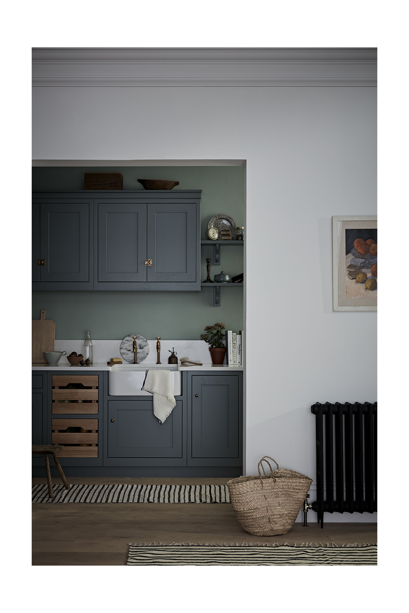
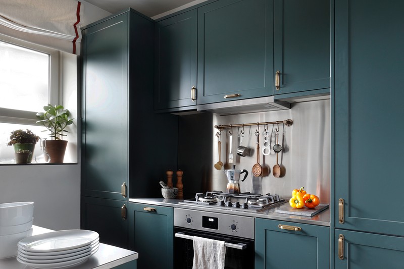
As for colour tones it’s tempting to go neutral with small kitchens but having a block of colour can lift small spaces, while dark colours can also be really impactful. “Go for a bold tone for all the doors with a lighter contrasting material for countertops (or vice versa with a lighter door colour and dark countertop), and something eye catching such as textured metal for the handles,” suggests Henry. Just be aware a single bold colour is fine, but too many bold colours or big patterns in a small space can be tricky to execute. “If you're looking to make an impact with colour then opt for tonality within a single colour pallete,” says Magnus. ‘And the same goes for materiality – don't go too wild, choose a few materials and introduce them in multiple places to tie the scheme together.”
Use Flooring To Give The Illusion Of More Space
If you are dealing with a long narrow galley-style kitchen, a great illusion can be running the floorboards left-right which makes the room feel much wider than doing the same lengthwise – equally, if the kitchen is literally in a corner of a dining/living space, have the same flooring throughout rather than zoning it and emphasising its size.
Make The Most Of The Finishes
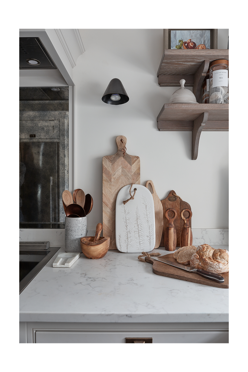
Light reflective finishes will bounce natural light around a small space and make it instantly feel bigger. “For a recent project, we chose a light grey composite stone from Caesarstone, antiqued mirror panelling for behind the hob (which has the double value of being both glamorous and easy to clean) and polished nickel ironmongery and tapware,” explains Katharine. “It’s best to keep all metal finishes uniform in colour – nothing makes a space feel more cluttered than a mixture of competing finishes. Polished nickel handles sit beautifully with a stainless steel Rangemaster cooker and pretty wall lights with nickel detailing. While I love brass and bronze, in a smaller space I always feel the lighter and cooler tone of polished nickel or chrome feels sleeker and more spacious.”
Finally, keep window treatments on the simple side, too. “An unstructured roman blind is perfect, linen adds pretty texture, and a simple vertical stripe pattern always makes a smaller window appear more generous,” adds Katherine.
For more information visit BlakesLondon.com, AnnaHewitsonDesign.com, HenryPrideaux.com, BenjiLewisDesign.co.uk, BurbridgeKitchenMakers.co.uk, KatharinePooley.com and VisualComfort.com.
DISCLAIMER: We endeavour to always credit the correct original source of every image we use. If you think a credit may be incorrect, please contact us at info@sheerluxe.com.
