Behind-The-Scenes Of This Interior Design Project
The Property
We were tasked by the Latin-American owners of a tired mansion block flat in Chelsea to transform it into a light-filled, elegant pied-à-terre for when they visited the city from their home in Florida. The brief was to revamp the apartment, opening it up to reinstate its original proportions and to create an elegant, well-flowing space with comfort and calm at its core.
The starting point was the reconfiguration of the flat – a complex process involving the knocking down walls, switching layouts and restoring the grand proportions and original features of the apartment. We worked with architects Studio McLeod to remodel the space, ensuring the architectural beauty of the original building shone through. Extending into the loft, the space was opened up to achieve a better flow between the various rooms and invoke more of a feeling of grandeur. The overall colour palette is mainly neutral – not only to create a sense of calm but to allow us to layer the space with richer tones and textures, taking inspiration from the client’s art collection as well as the natural views from the vast bay windows.
The Living Room
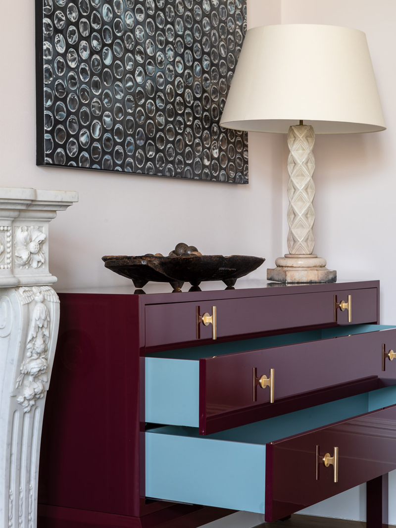
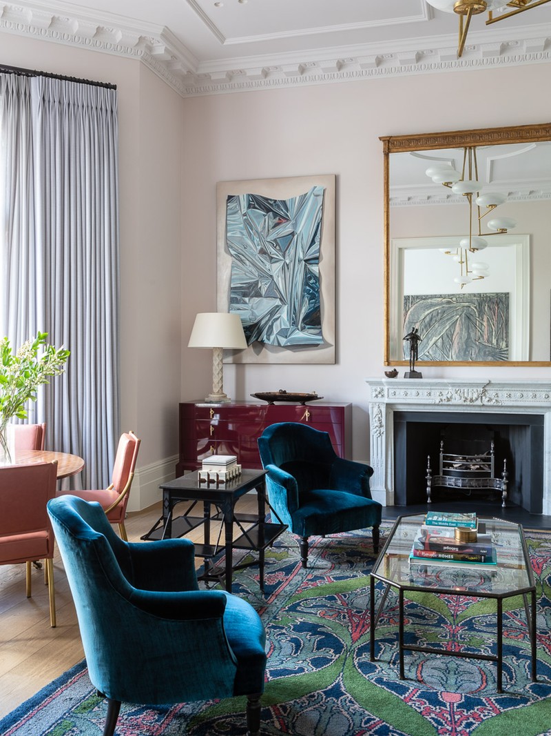
The ethereal pale faded pink of Atelier Ellis Faded Blossom on the walls provides a calming backdrop for the otherwise grand proportions of the room. In our search for the perfect piece to anchor the space, we uncovered a Donegal Arts & Crafts rug attributed to Charles Voysey – thanks to its vibrant jewel tones, it pretty much dictated the palette of the furniture we used in the room. Because the client has a keen interest in craft and antiques, that rug is bound to be treasured for years to come.
The sofa is a Kitesgrove design called The Elbourne, handmade in collaboration with Ensemblier and upholstered in Clementine Oliver Angus Wool. The duck egg blue colour is light and fresh and sits comfortably with the paintings by Chilean artist Nicolas Radic which flank the fireplace. The 1960s pendant light is from Sambataro, and we used an identical fitting in the family room to ensure more fluidity. The red and pink tones of the rug are tied together with the opera dining chairs from Soane Britian, which are upholstered in musk leather.
The Family Room
/https%3A%2F%2Fsw18.sheerluxe.com%2Fsites%2Fsheerluxe%2Ffiles%2Farticles%2F2021%2F06%2Fkitesgrove-house-tour-family-room1.jpg?itok=pE3RZILa)
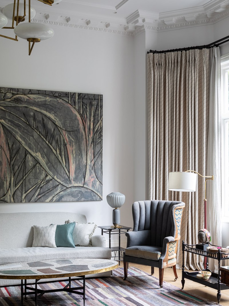
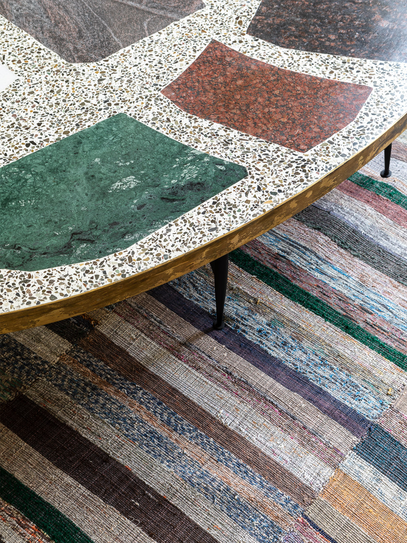
The Jose Bedia artwork featured in the centre wall dominates the family room, setting the colour palette for the space against a neutral backdrop of Farrow & Ball's Wevet. The 1950s hand knotted Anatolian tribal kilim from Rare Rugs and the mosaic Magic Stone Coffee Table from The Future Perfect echo its tonality.
Kitchen
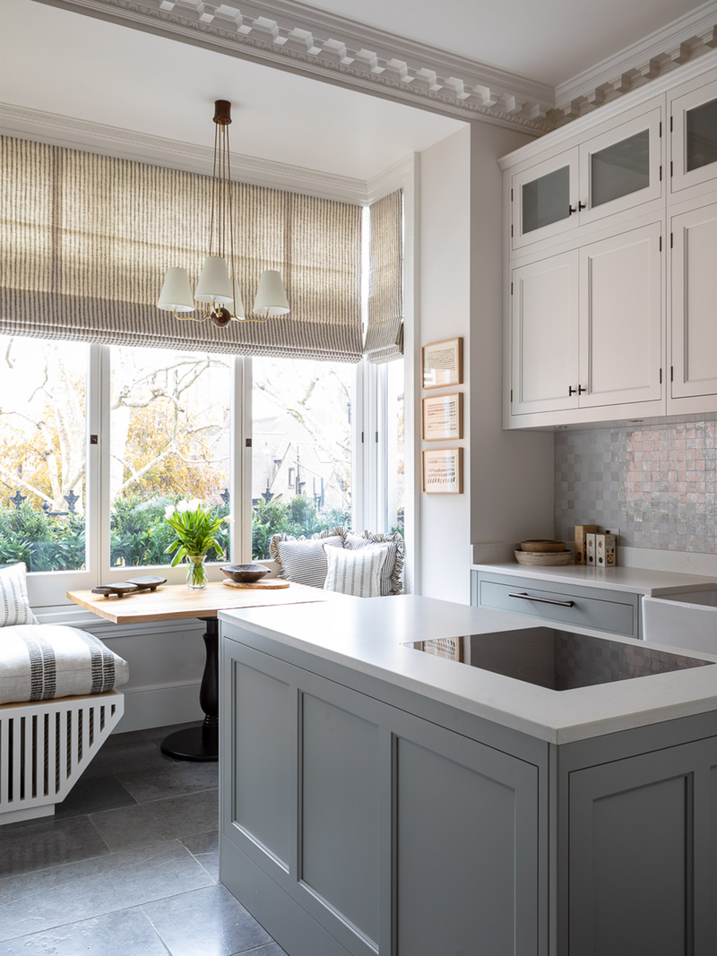
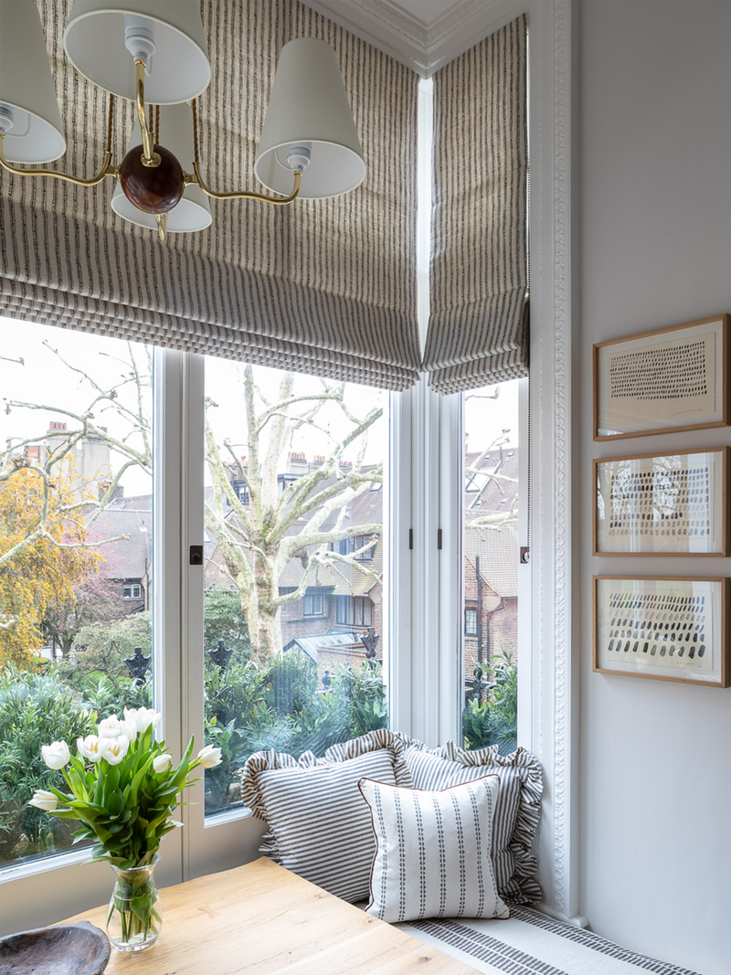
Continuing the neutral theme, the kitchen is a Teddy Edwards' hand-painted Shaker-style kitchen with Joseph Giles dark bronze handles. The foundation of the white walls, Zellige tiles and the off-white cotton pendant light from Kalmar allow the blue floor stone from Artorius Faber to make a but of a statement. Meanwhile, the striped roman blinds and cushions from Brook Perdigon and The Cloth Shop tie in perfectly with the mark-making artwork by Maria Yelletisch from Galeria Marita Segovia.
Hallway
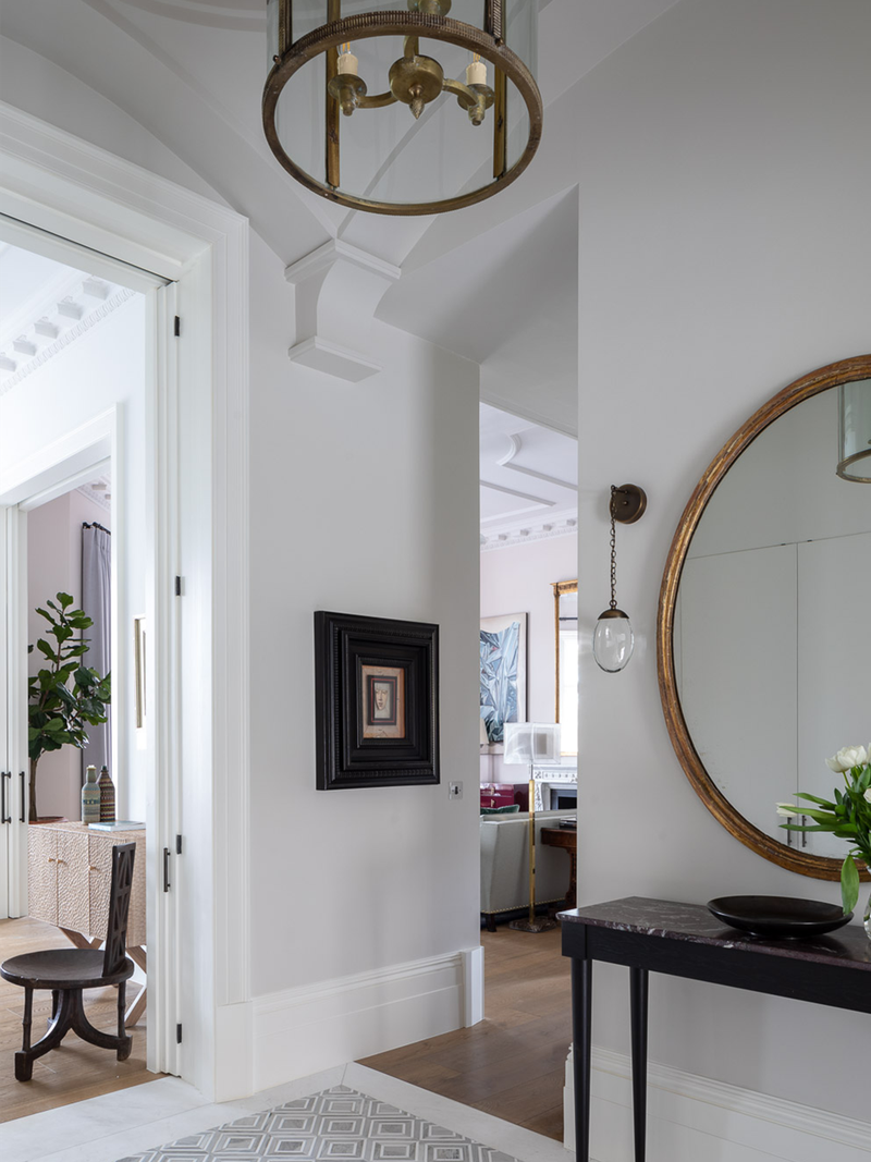
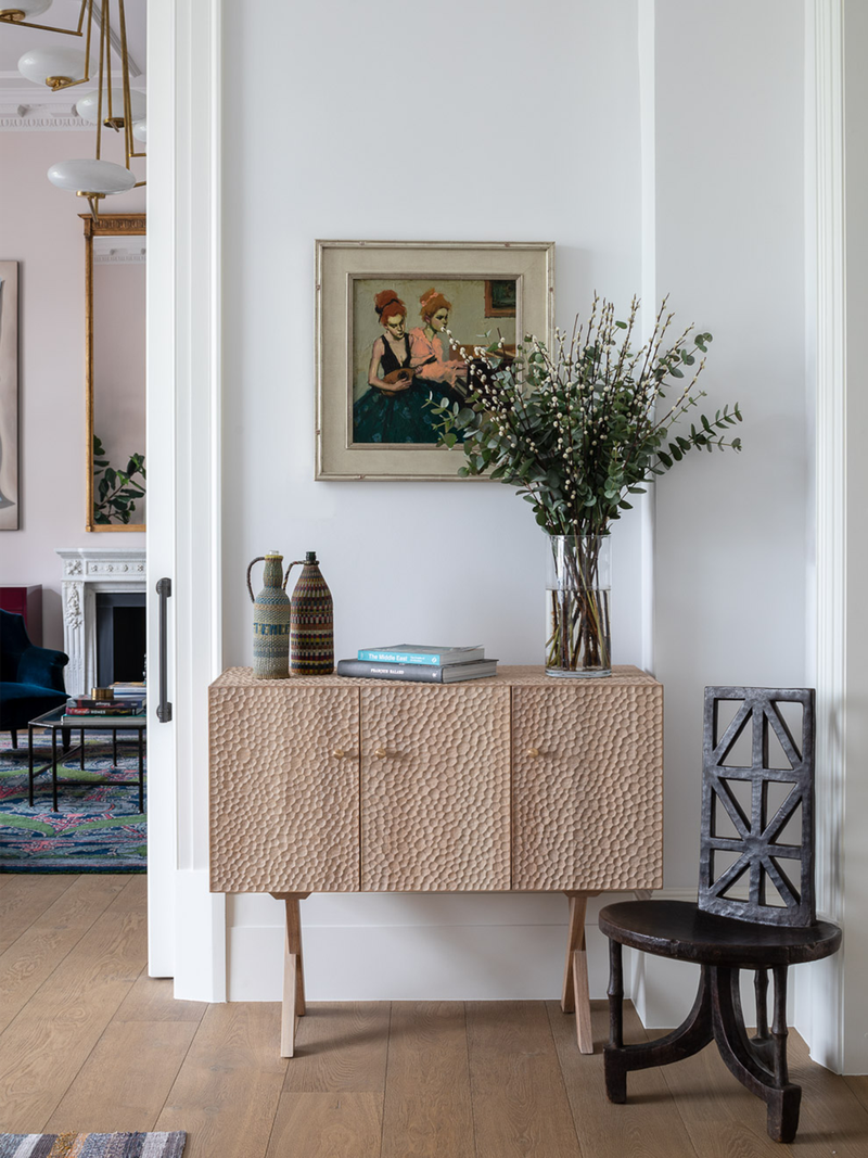
In the hallway, we extended into the loft space, resulting in an elegant double height hall with an impressive domed ceiling. The raw plaster finish and tiled floor makes a striking first impression and sets the tone for the rest of the apartment.
The Master Bedroom
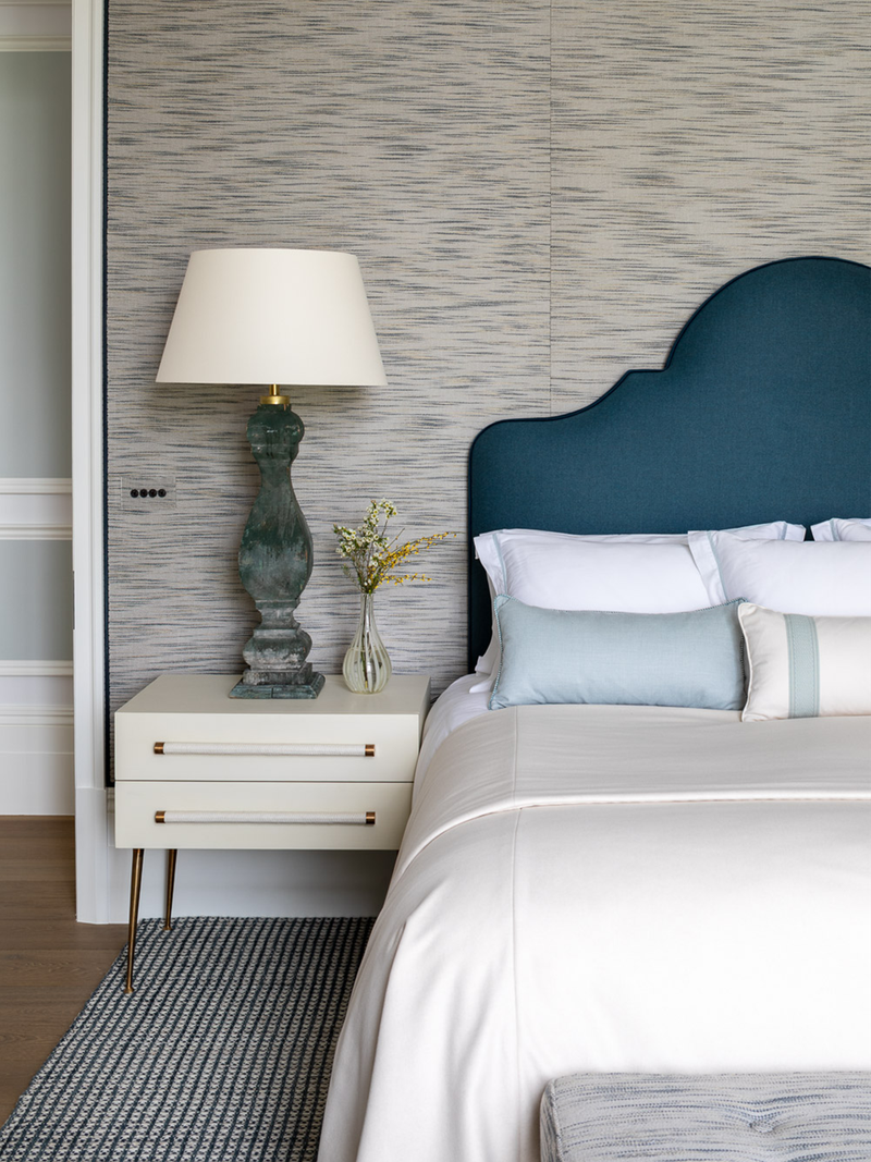
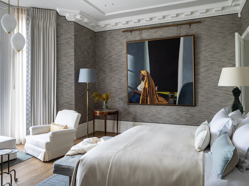
The master bedroom exudes comfort and elegance. The client’s own artwork was the inspiration for us – specifically, a portrait by Cuban artist Miguel Padura whose subject appears to be enjoying the bedroom’s vista. We wanted to emphasise the blue shades in the portrait and chose Donghia Oasis’s wallcovering fabric in Sky as a backdrop for the room. We designed The Durham headboard in collaboration with Ensemblier, upholstering it in a co-ordinating dark blue Lelievre cotton velvet with Holland and Sherry wool piping.
In the en-suite master bathroom, the floor has a bold geometric tile from Ann Sacks, Mullholland Large, Liaison by Kelly Wearstler Mosaics, taps by Pinna Paletta Collection by Laura Kirar in Nickel Silver finish and above is a bespoke mirror cabinet.
The Guest Bedroom
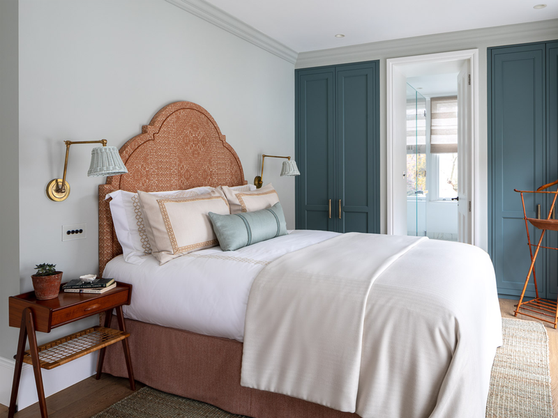
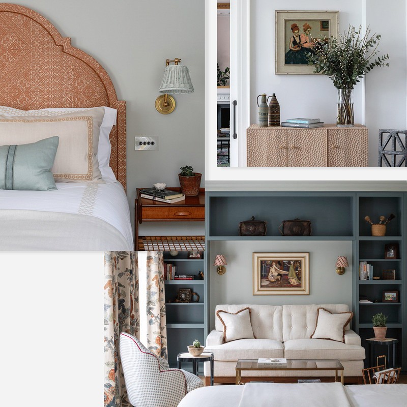
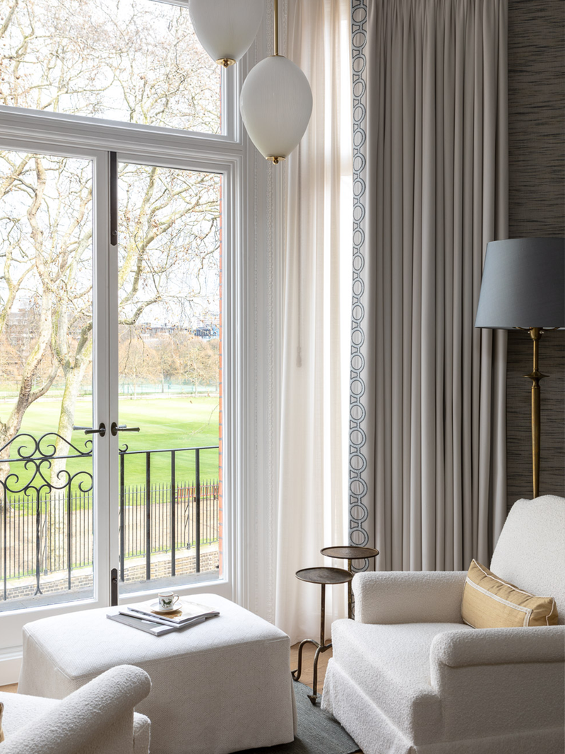
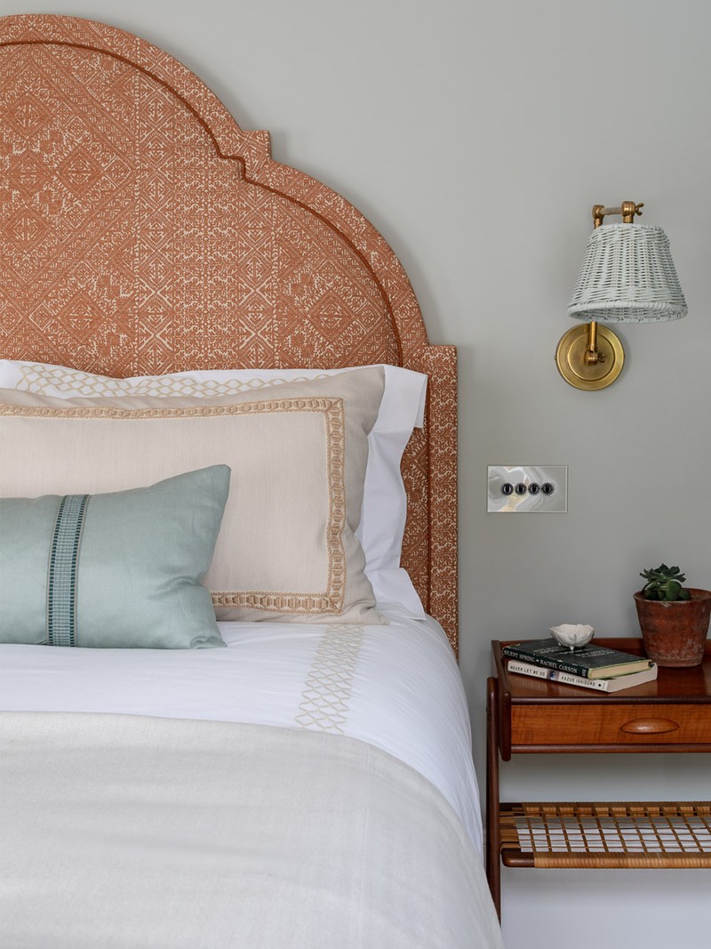
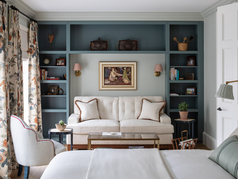
The joinery niche created for a Kingcome sofa bed in the guest bedroom was an effective way of using the available space, while providing a focal point to the room, as well as a cosy library and seating corner to retreat to. The walls are painted in Farrow & Ball's Cromarty, a light green grey that offers a pared-back feel and added softness to the room. The Durham headboard designed by Kitesgrove for Ensemblier is used again here, this time upholstered in Guy Goodfellow Fez Weave in Cognac so it takes on an entirely different character.
In the en-suite bathroom, the floor tiles are marble mosaic tiles called Calacatta Borghini Diagonal Weave by Ann Sacks with taps from Style Morderne Collection in a Polished Chrome finish by Samuel Heath. Above hangs a curvy decorative mirror by Nicholas Haslam, flagged by these fluted glass wall lights from Drummonds.
To see more of Sophie’s work, visit Kitesgrove.com
DISCLAIMER: We endeavour to always credit the correct original source of every image we use. If you think a credit may be incorrect, please contact us at info@sheerluxe.com.
