7 Dream Nursery Moodboards
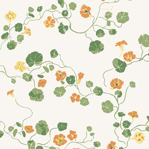
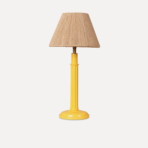
“This nursery scheme is suitable for a boy or girl. I love using wallpaper, and a nursery is the perfect room to have a bit of fun with – I chose this botanical and whimsical wallpaper from Lake August and pulled out the leafy green with Farrow & Ball’s ‘Whirlybird’ on the woodwork. Children grow up so quickly, so a nursery needs to be a room that can accommodate change, and one that you can easily adapt as your child grows – inevitably furniture will move around, and tastes will change so it’s important to have a level of flexibility. I’ve kept the furniture loose to allow for this and added splashes of colour with the lamp and chair. I love the yellow – it complements the green and brings a bit of warmth to the room.”
Visit AnnaHewitsonDesign.com




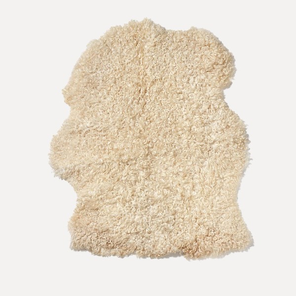
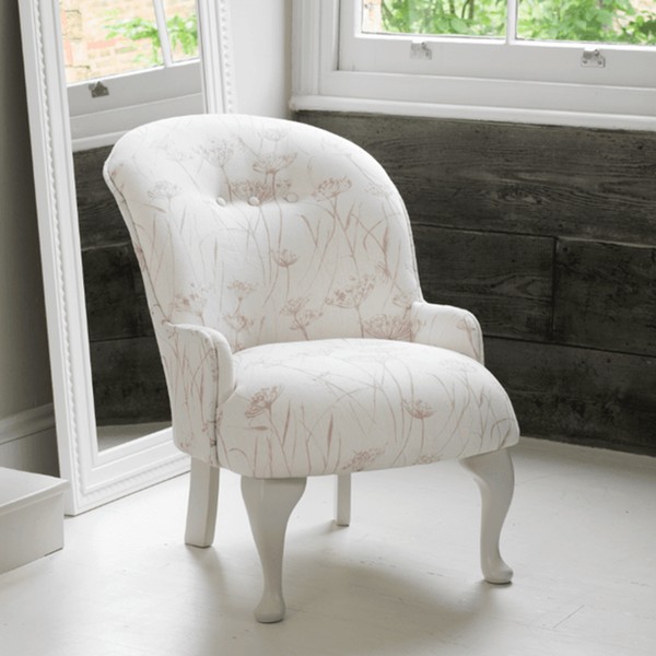

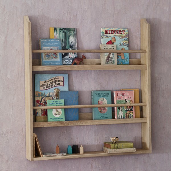
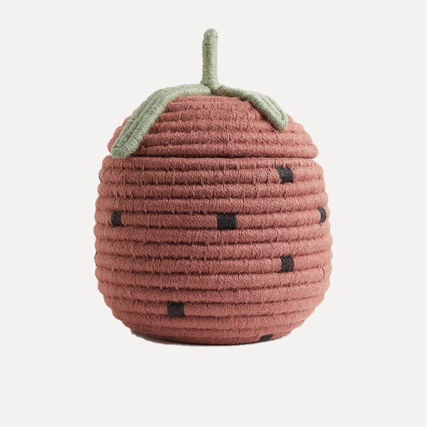
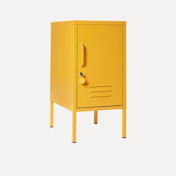
“I love designing rooms for my younger clients as children are so open and creative. This room for a little girl started with this wonderful leopard rug. I wanted to nod to pink but by using a turquoise and white wallpaper, turquoise bed and lots of darker pink and red elements, it stops it being too sickly sweet. The yellow locker side table is always useful – it’s a great size and comes in lots of different colours. Plus, I love the strawberry baskets which could sit in a row to store toys.”
Visit OliviaEmery.com




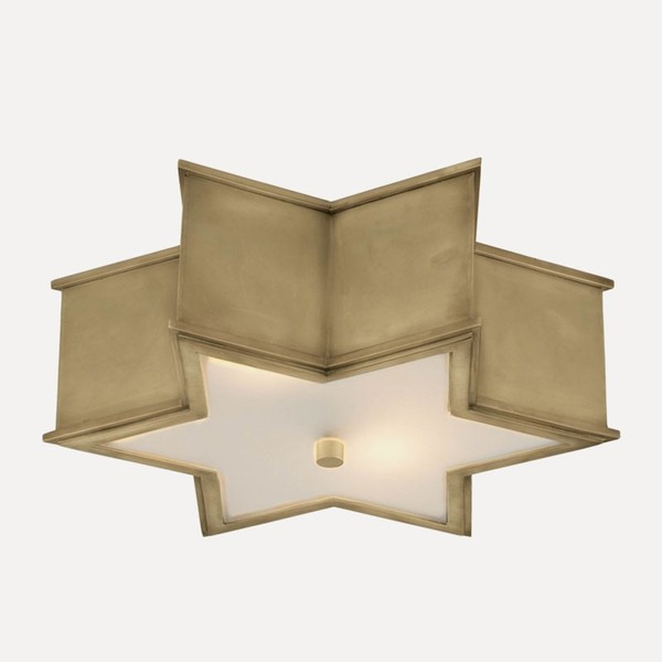

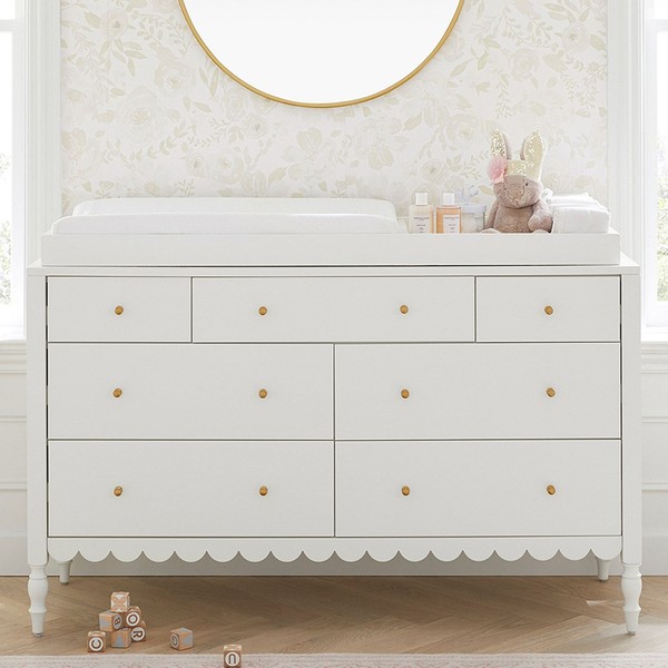
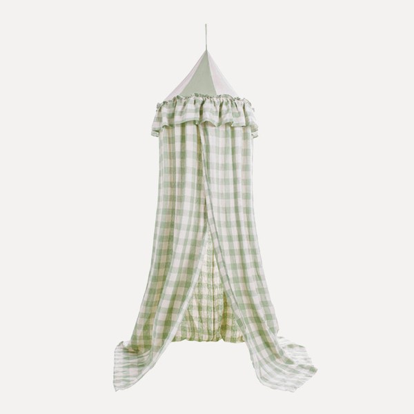
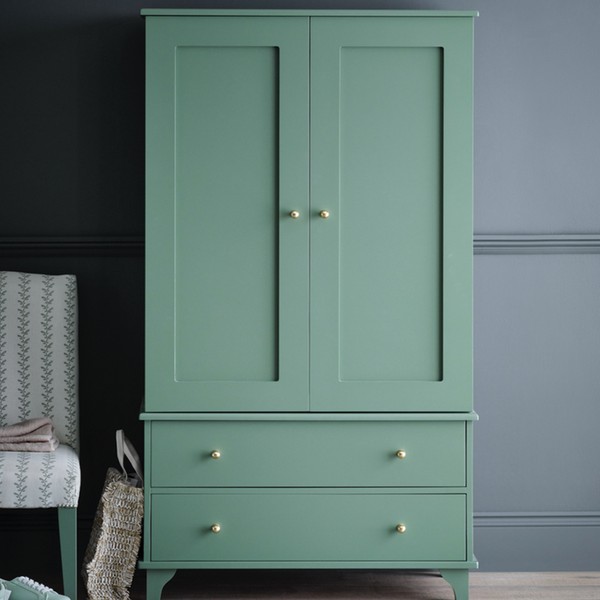
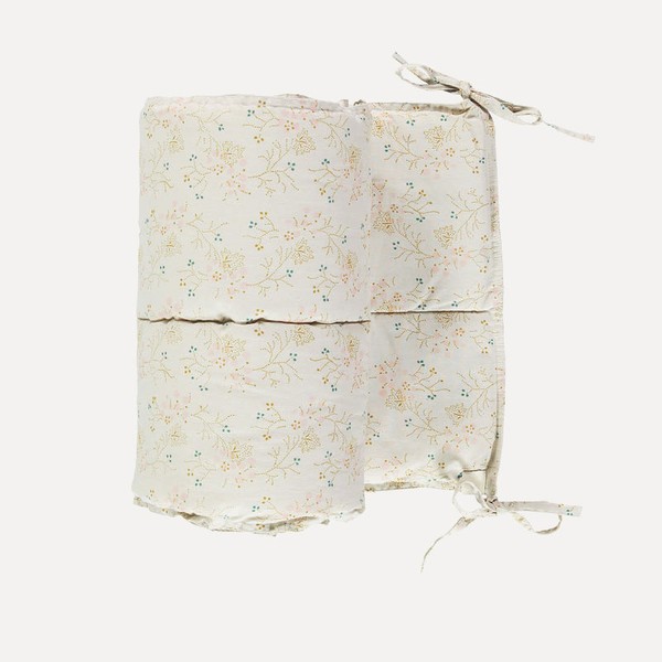
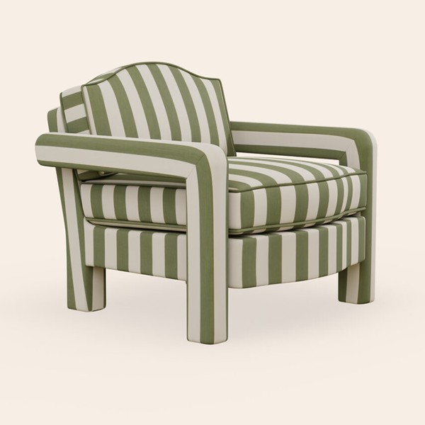
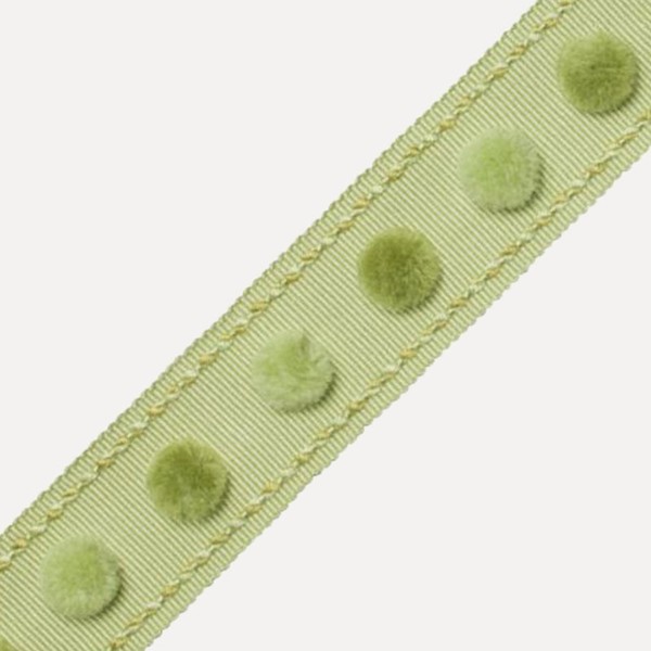
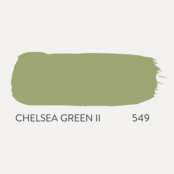
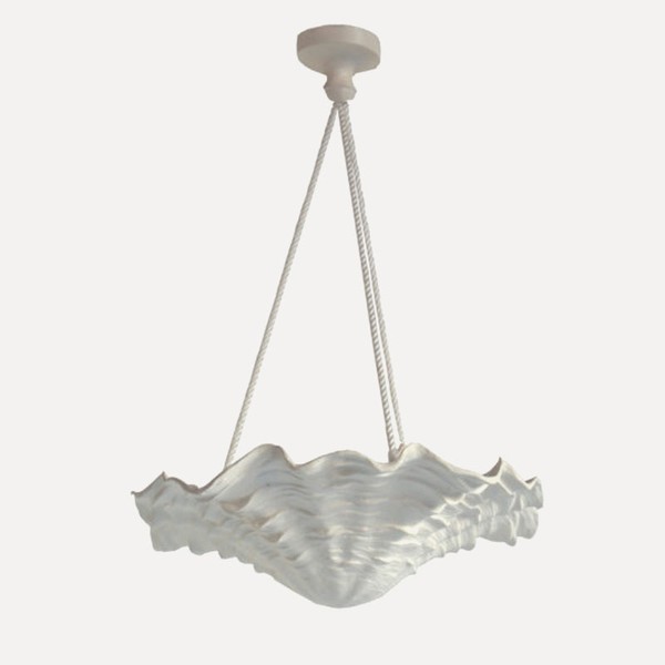
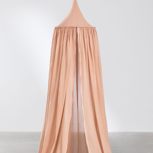
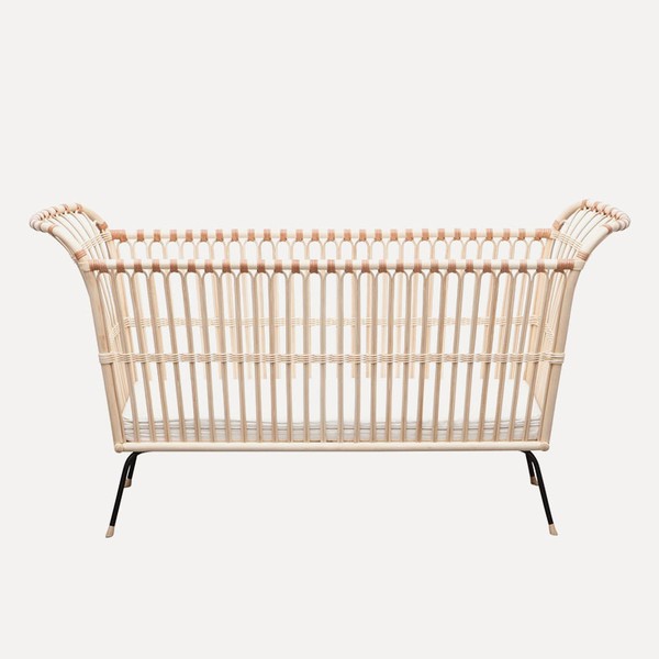
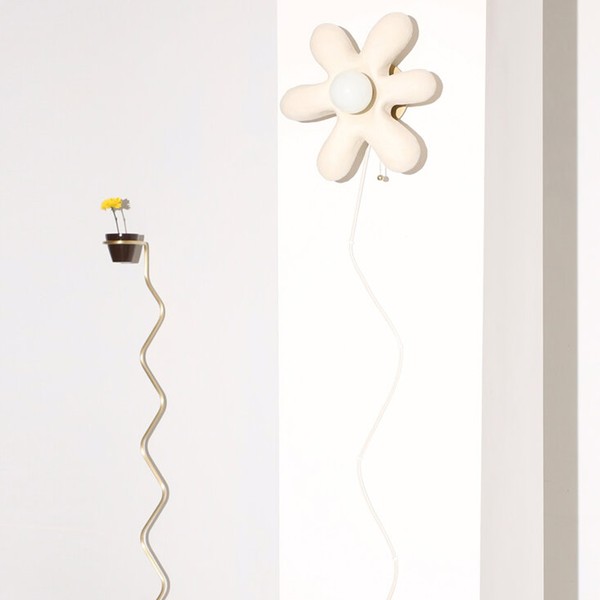
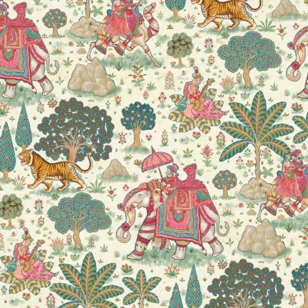
“The starting point for this room was the whimsical Indian-inspired wallpaper from Warner House. The green and pinks from the wallpaper inform the main colours in the room, while a contemporary rattan crib from Smallable with a linen bed canopy will encourage peaceful sleep. The woodwork and bespoke baby changing table will be painted in Paint and Paper Library’s ‘Chelsea Green II’, while stripes and checks are used on the nursing chair and curtains. These traditionally quaint fabrics are then counter-balanced by sculptural elements like the plaster pendant light from Paolo Moschino and the mirror from Margit Wittig. The lighting can be adjusted for atmosphere in the room – my hero piece is the wall light from Eny Lee Parker.”
Visit LauraStephens.co.uk

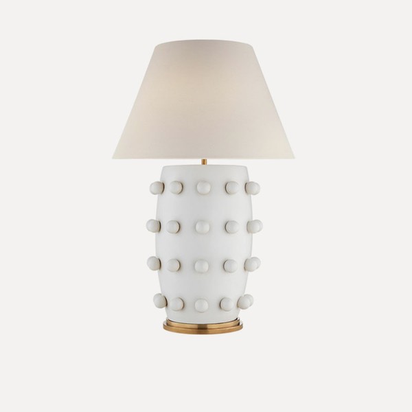
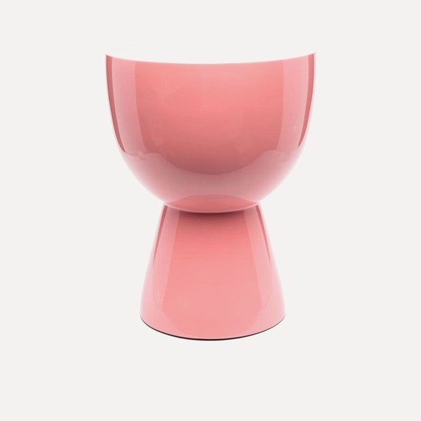

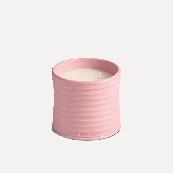

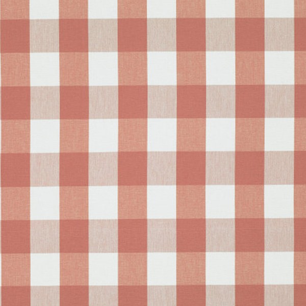

“I always approach a nursery with colour, playfulness and texture but tend to steer clear of any wallpapers or fabrics that are too babyish; there’s no need to use childish prints, as they will only grow out of them. I like to use playful accessories such as lamps, lampshades and cushions, and team them with pieces that will always be loved – such as an antique chest of drawers or an old trunk filled with toys. In this nursery, I’ve placed a red gloss lamp next to a bobbin bedside table. The walls are covered in the same voile as the curtains, which has been paper-backed to apply to the walls easily. The Swedish flatweave rug is joyful and the pattern is great at hiding marks.”
Visit OctaviaDickinson.com
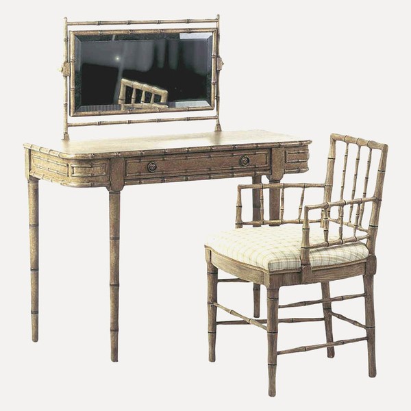

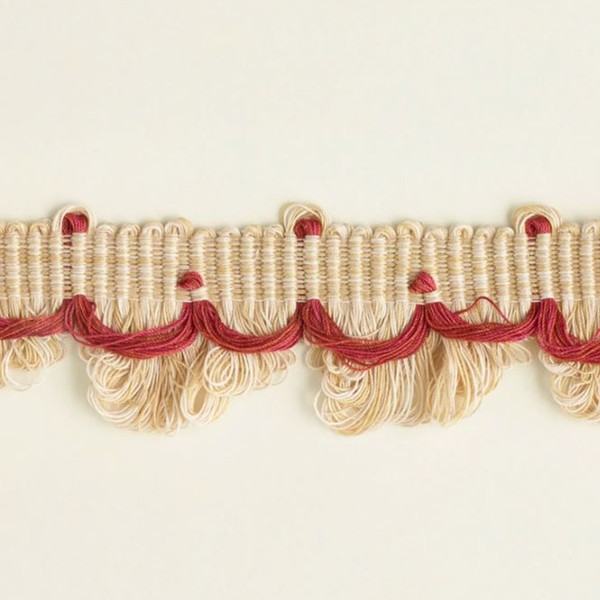
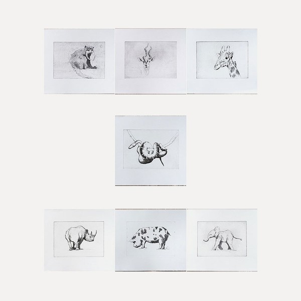
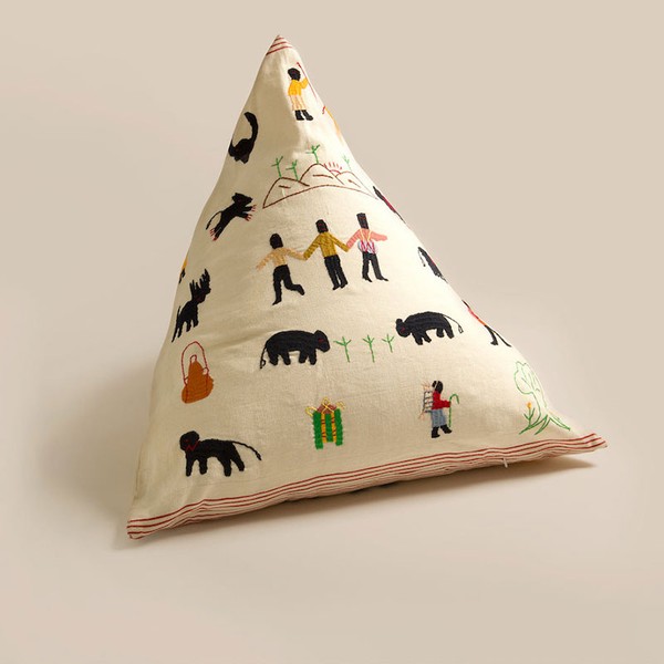
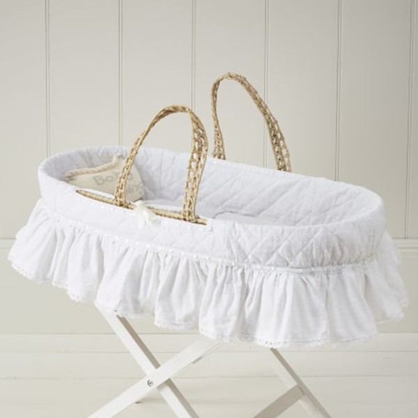
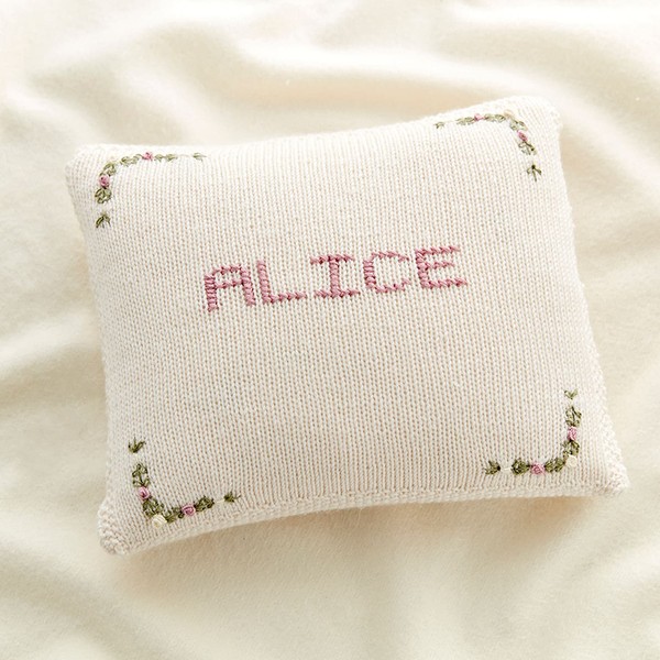
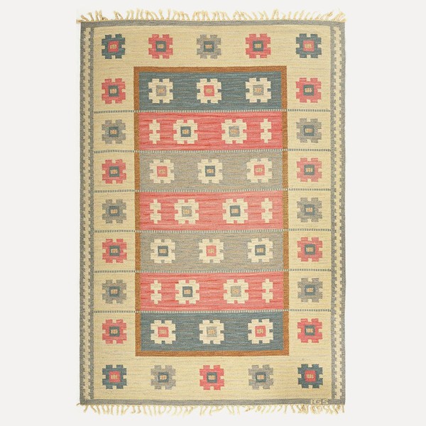

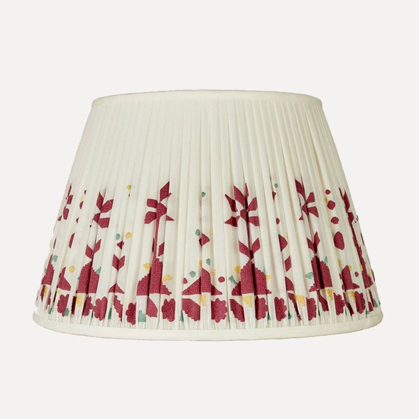
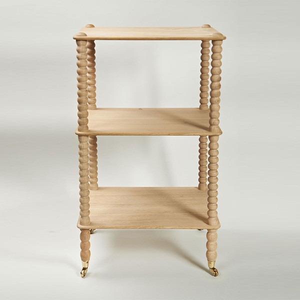
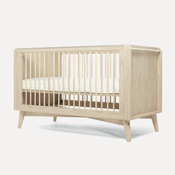
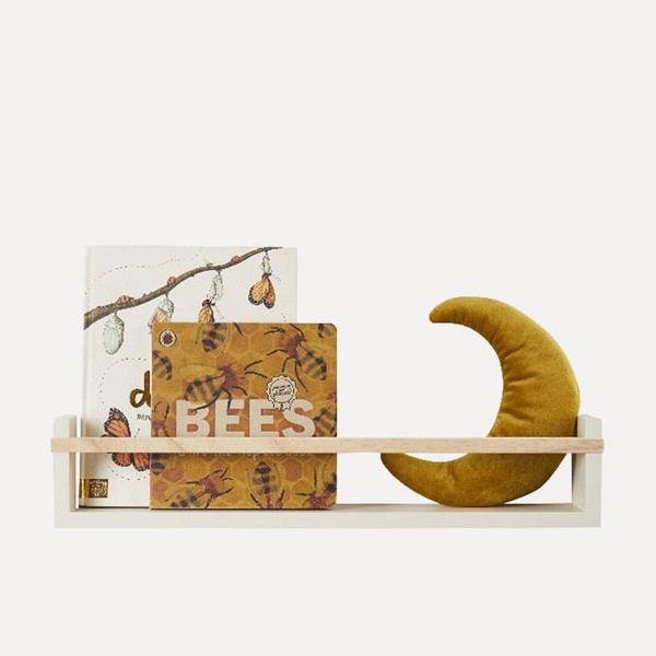
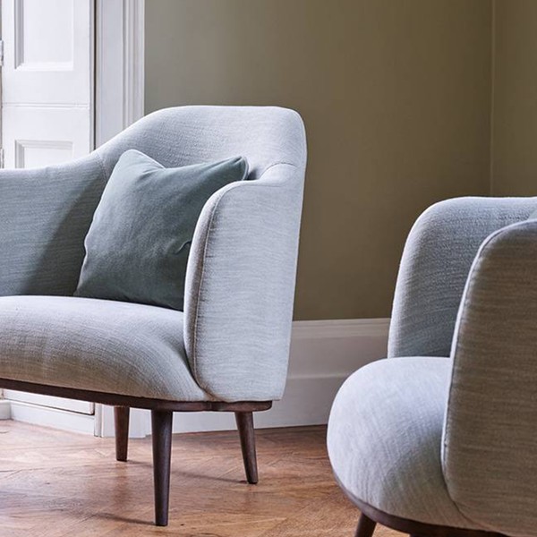
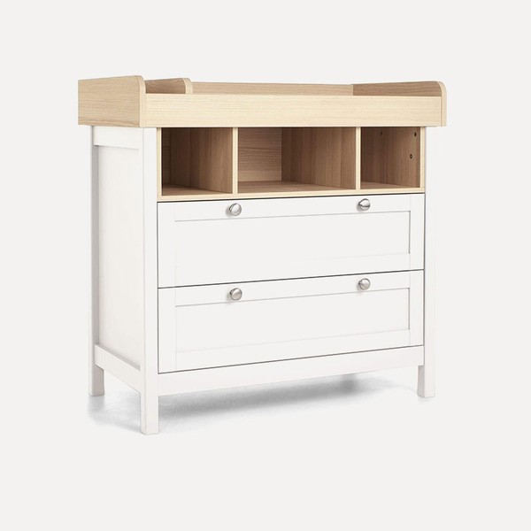
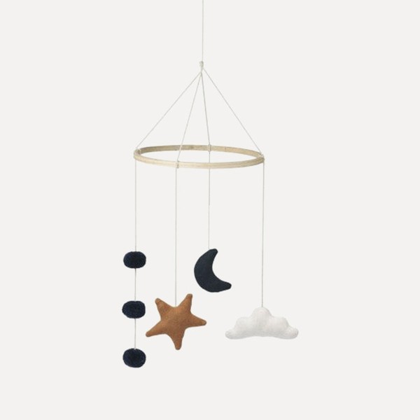
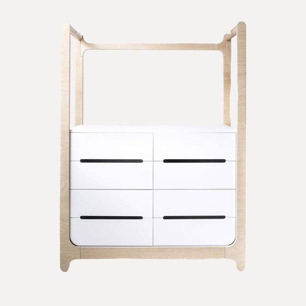
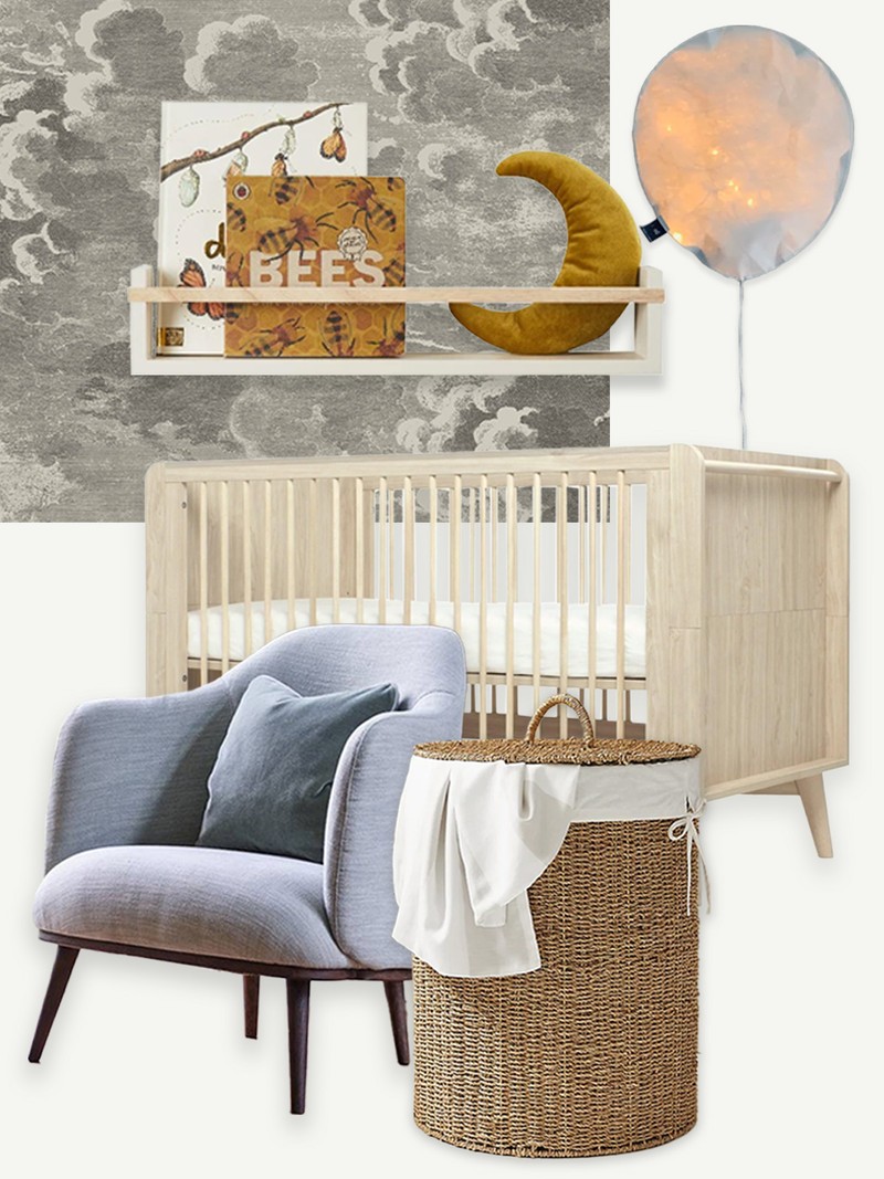
“A neutral nursery helps with sensory overload and creates a calm space for mother and baby. We treat the space as a blank canvas, adding accents, such as the wood on the cot and wardrobe, and shelves to display toys and books. Different levels of lighting, including lamps and dimmers, allow you to control the light at different times of day and night, while the nursing chair and side table create an adult’s corner – especially useful during feeding time. You can then add decorative pieces to add interest, such as the beautiful mobile.”
Visit Stanza-ID.com




Moira Butterfield & Harriet Lynas,

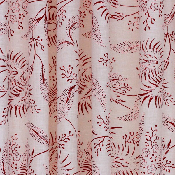
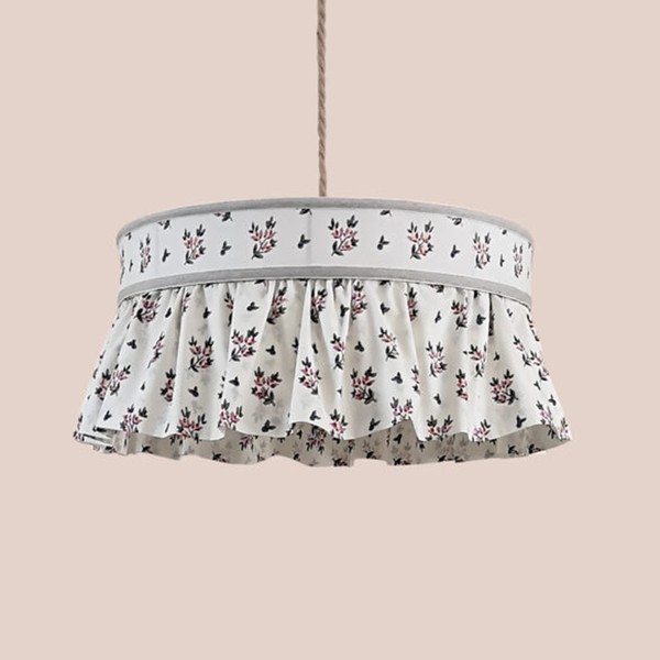
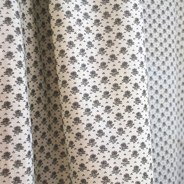
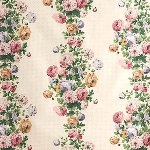
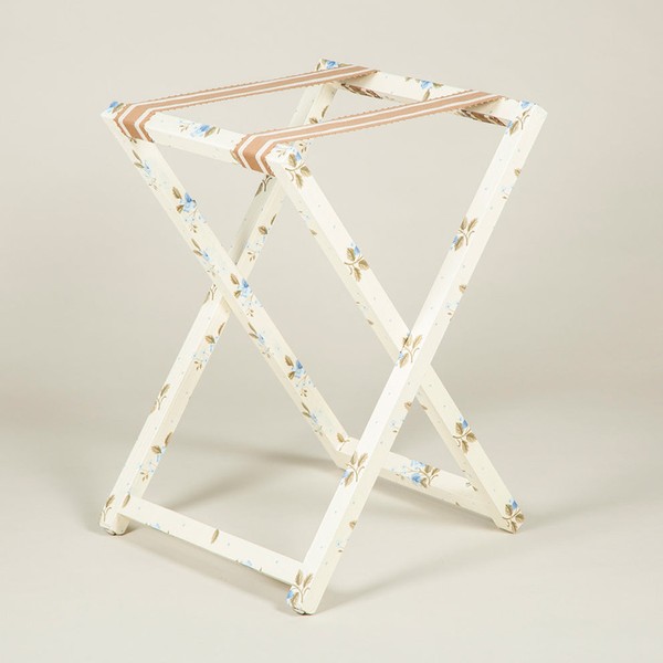
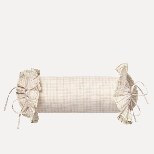
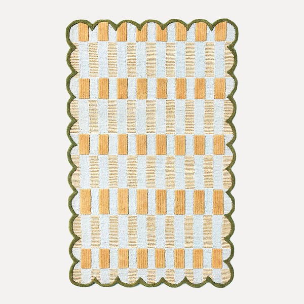
“I’ve always dreamt of creating a quintessential English nursery, layered with antique chintz, hand-printed pukka print linens and pretty ruffles. This scheme is inspired by patterned textiles and it’s a celebration of different craft techniques – be it the way Antoinette Poisson creates its beautiful handmade rag domino wallpapers, or the intricate, patient detailing on the hand stitched kilim rug by Francesca Gentilli. It really is a great example of how to do pattern on pattern.”
Visit StudioFaeger.com

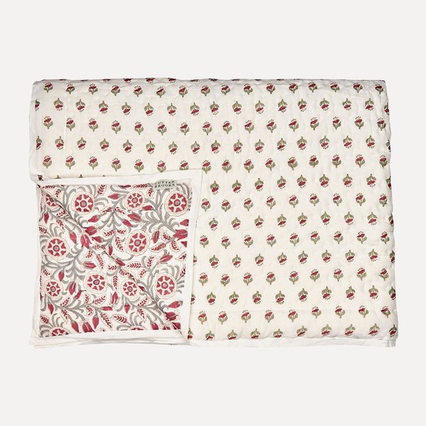
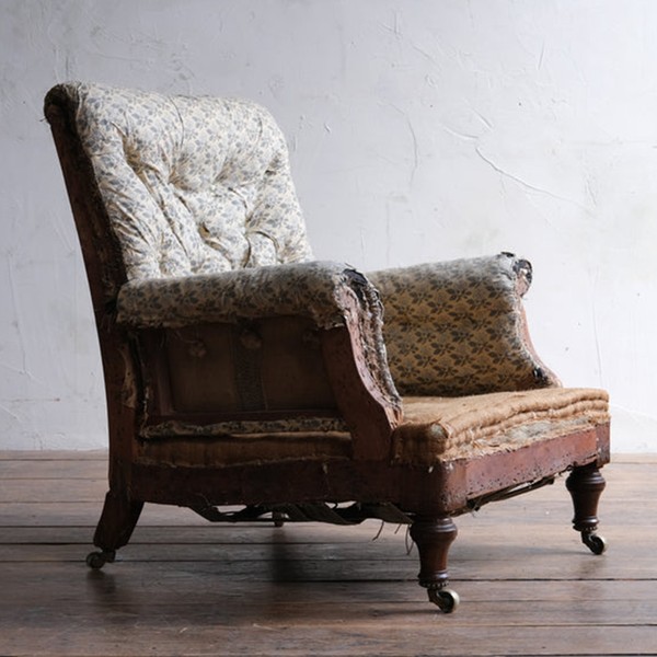
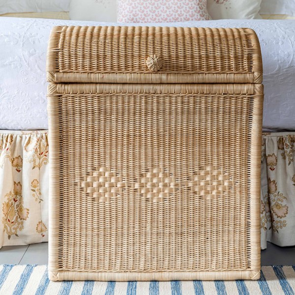
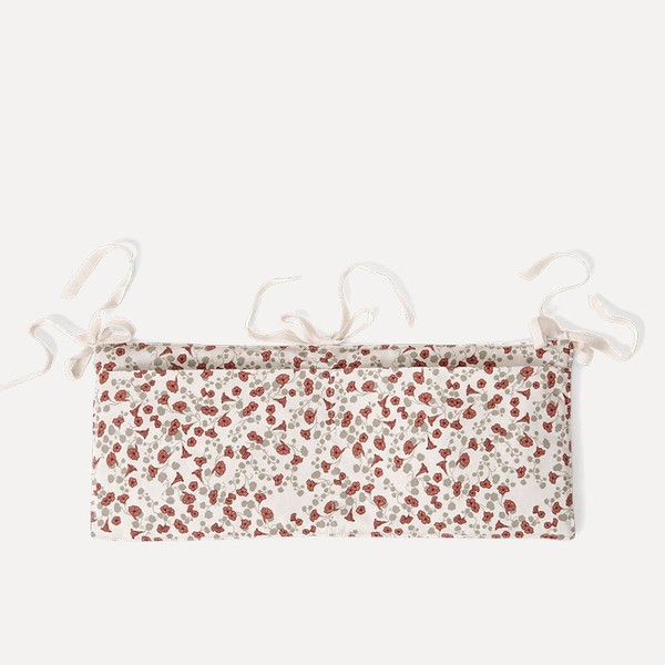



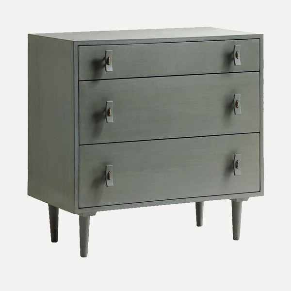
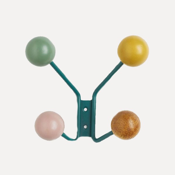
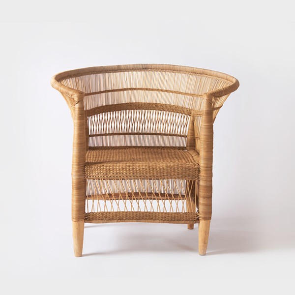
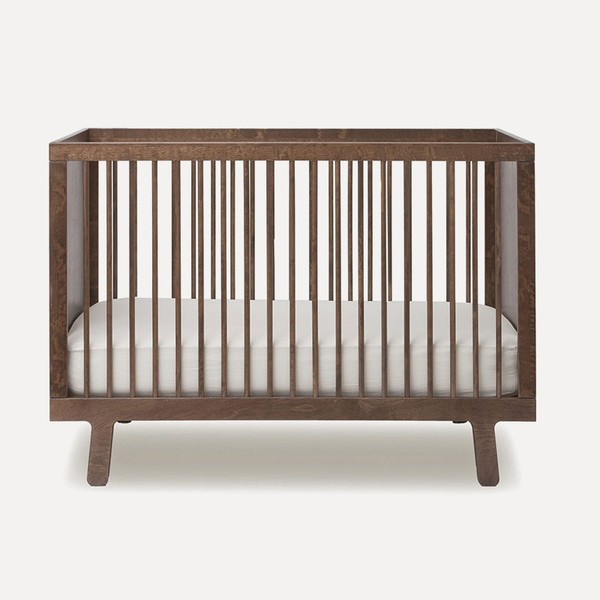
“In this boy’s nursery we wanted to create a timeless, soothing space and avoid traditional stereotypes and themes that will quickly be outgrown. The wallpaper is playful yet soft in tone to avoid over stimulation. Mustard touches make the room feel uplifting, fun and fresh, and we love this stylish walnut cot which adds a sense of refinement. Storage – an essential component in any nursery – is provided by the Chelsea Textiles chest of drawers and colourful hanging rack from H&M. The Pinch pendant and Hadeda chair add organic shape and texture, elements which are key to creating warmth and depth to any bedroom.”
Visit Otta-Design.com




DISCLAIMER: We endeavour to always credit the correct original source of every image we use. If you think a credit may be incorrect, please contact us at info@sheerluxe.com.
All products on this page have been selected by our editorial team, however we may make commission on some products.
/https%3A%2F%2Fsw18.sheerluxe.com%2Fsites%2Fsheerluxe%2Ffiles%2Farticles%2F2023%2F04%2Fanna-hewitson.png?itok=qLGY7RZG)
/https%3A%2F%2Fsw18.sheerluxe.com%2Fsites%2Fsheerluxe%2Ffiles%2Farticles%2F2023%2F04%2F2olivia-emery.png?itok=gJN3qAWe)
/https%3A%2F%2Fsw18.sheerluxe.com%2Fsites%2Fsheerluxe%2Ffiles%2Farticles%2F2023%2F04%2Flaura-stephens.png?itok=ODo6h7Bi)
/https%3A%2F%2Fsw18.sheerluxe.com%2Fsites%2Fsheerluxe%2Ffiles%2Farticles%2F2023%2F04%2Foctavia-dickinson.png?itok=dAWIh9pO)
/https%3A%2F%2Fsw18.sheerluxe.com%2Fsites%2Fsheerluxe%2Ffiles%2Farticles%2F2023%2F04%2Fthea-ingram.png?itok=ieoLT8s6)
/https%3A%2F%2Fsw18.sheerluxe.com%2Fsites%2Fsheerluxe%2Ffiles%2Farticles%2F2023%2F04%2Fvictoria-barker.png?itok=mxb2mmQF)
/https%3A%2F%2Fsw18.sheerluxe.com%2Fsites%2Fsheerluxe%2Ffiles%2Farticles%2F2023%2F04%2Fali-johnson.png?itok=xfCcApLz)
