Meet The Property Developer Setting New Standards Of Design
Tell us a bit about Banda and why you started the company?
It’s taken time to get to where we are today. I’ve always had a deep appreciation of how spaces work, be it at home or elsewhere. My mother worked in commercial property – I used to go on site tours with her and ask lots of questions. After I left university, I knew I didn’t want to take a traditional path – I felt strongly there was a gap in the residential development market. At the time there were so many ‘cookie cutter’ developments in the capital, and few seemed to place any emphasis on quality design. I also like the challenge of having to breathe fresh life into older buildings, which is why I’ve taken on development projects like an old bakery in Battersea. The spaces there sold out within 24 hours – and that’s when I knew I had what it took to take the business global.
You mentioned ‘quality design’ – what does that mean to you?
‘Design for living’ is our mantra. It’s no good designing a space that doesn’t work practically or flow for the owner. Nature, the materials we use and the craftspeople we work with are all strong inspirations and form the starting point of each project. Context is everything; it pays to take design cues from the location and architecture of the building so that the end product is in keeping with its surroundings. It should never look like the interiors have just been parachuted in. We source vintage items, objects, art and pieces from all over the world. The Banda signature is to blend old and new to create spaces that have a strong sense of home.
What does it take to make a property like an old bakery fit for luxury living today?
Marrying the demands and expectation of modern-day living with the restrictions and limitations of working within a heritage building is a challenge. Air con, underfloor heating, security systems, smart sound and light systems and AV systems – all are necessary elements that need to be seamlessly worked into the fabric of the building.

You design homes all around the world – are there any elements you see time and again?
It's become very apparent since the pandemic that each client, wherever they are in the world, is keen to tell a story with their design. While the look is important, the meaning and long-lasting appeal of the pieces very much underpin the overall style. We intentionally source and shop for pieces alongside our clients, while also incorporating their own heirlooms into the space.
How is sustainability changing the top end of the market?
Sustainable choices were traditionally something we’d encourage our clients to consider but now, for the majority, they are non-negotiable. On the supply side, it’s wonderful to see so many suppliers taking a more sustainable approach – but there’s still a long way to go.
What other trends are you seeing in the luxury design space?
It’s been very refreshing to see the ‘wabi sabi’ trend gain momentum. Rather than stark machine-made furniture pieces, many are preferring a more ‘perfectly imperfect’ artisanal feel. Natural light also amplifies the feeling of wellbeing in any space, so many of our clients want to open up and knock through to ensure light streams through each room.
Now, Edo talks us through three recent projects…
111 WEST 57th, NEW YORK
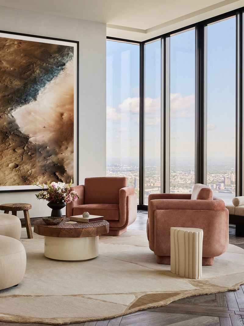
When we were approached to design the penthouse for the Steinway Tower, it felt like a natural fit due to the history and the fact that, as the second tallest building in the western hemisphere, the tower is an icon for future generations.
At the base of the tower, the historic Steinway Hall acted as both a gallery for the Steinway pianos and as an entertainment venue. For Banda this was the place to start when thinking about how we wanted to design a lateral penthouse apartment with some of the best views in the city. We wanted it to feel like a collection of thoughtful pieces from across the globe, each telling their own story while creating a space that works for entertaining and enjoyment.
Having spent more time in New York over the past few years, it has struck me that the city is very much a sum of its parts: while the pace is extremely fast (even more so I think than London), there are surprises and moments of history around every corner. The culture and buzz are palpable. We wanted to honour and celebrate this cosmopolitan, modern-day New York in our choices.
The Signal Y pendants by Apparatus Studio in the Great Room celebrate the ‘now’ of the city – modern, energetic and creative. The art by Andy Warhol in the bedroom is a reminder of one of the city’s most influential figures. A personal favourite of mine is the Oscar Niemeyer chair in the principal bedroom suite. Niemeyer is a Brazilian 20th-century icon who was one of the most exciting modern architects, and the chair sits beautifully among the other pieces as a reminder of how New York today is a true blend of styles and inspiration.
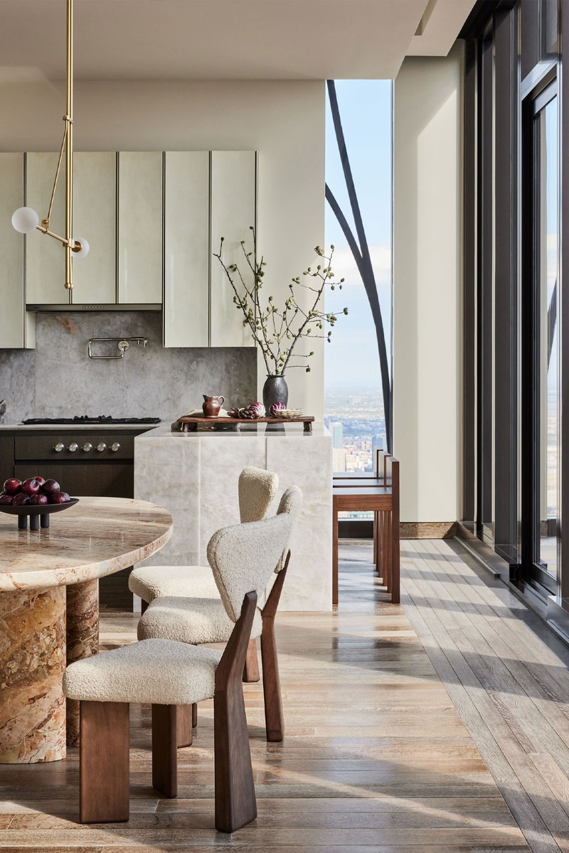
Central Park is the heart of New York. Our design and furniture choices celebrate the ever-changing, seasonal views of the park, while allowing the feeling of elegance and, importantly, space and calm. We chose the curved 280 Sofa by Pierre Augustin Rose to create an embrace while leading the eye into the park – it gives a sense of inclusivity and warmth. The Swan Dining Table by Francesco Balzano celebrates the elegance of the city from above – the oval top is reminiscent of a swan’s wingspan and creates a focal point for the view.
Natural materials and sustainable design are important to us. In this apartment, we wanted a feeling of nesting in the sky – a sense of peace and being at one with nature. The handmade, freestanding nickel bathtub in the principal suite by William Holland was a nod to our British design DNA. I also love the coffee table in the Great Room with its brutalist accents of gouged wood – the texture is so inviting and celebrates imperfect nature at its best. We worked closely with Nous Art in Paris to source the art throughout the apartment – it opened my eyes to some incredible pieces, and we had such fun in the process. The custom pieces are beautiful artworks in their own right, but it’s when they come together in this space that the magic happens.
For me the craft is always when the design comes alive – we start with a few key pieces and then build up our selections from there. Every piece has been chosen to last – they are collectors’ items that can be passed down the generations. One of my favourite craft pieces is Atelier Février’s Nazar rug in the main bedroom – these pieces are hand knotted in Nepal in a process that involves a workforce of around 50 expert craftspeople.
AVENUE ÉMILE-DESCHANEL, PARIS
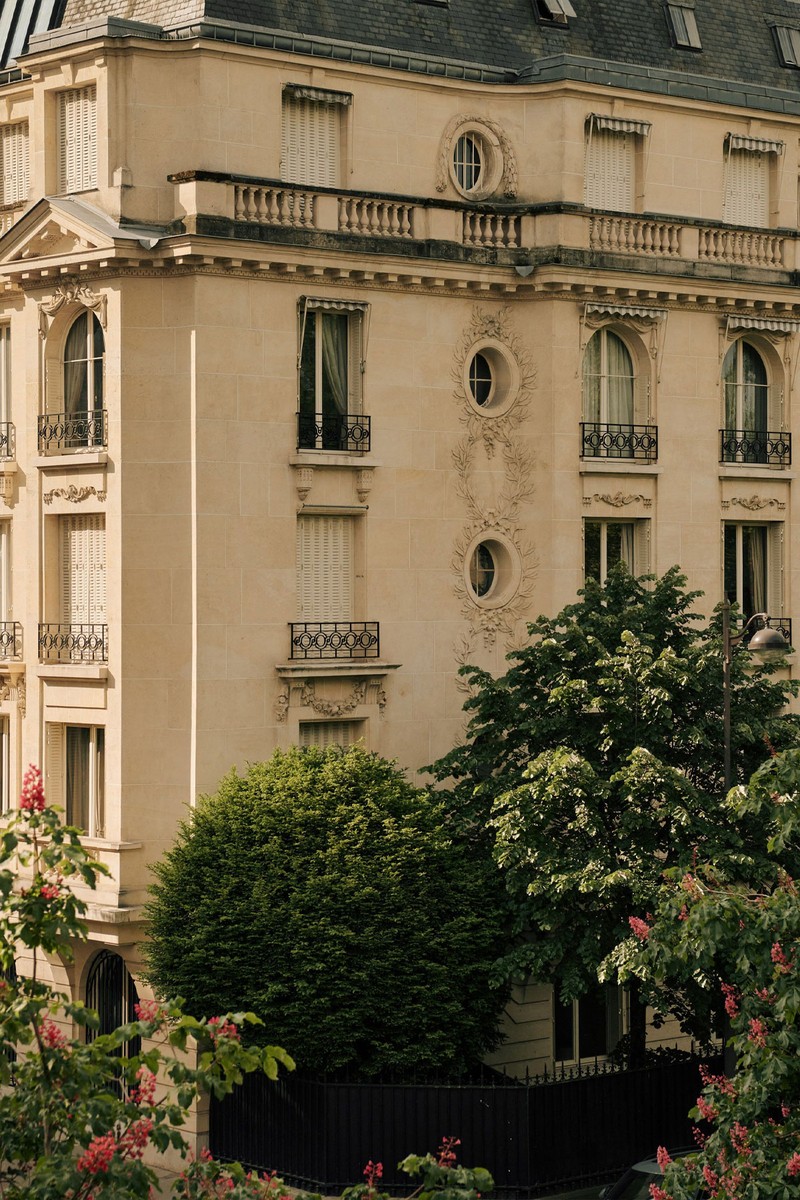
It has been a huge privilege to design and redevelop this exceptional space in a special location. As always, the design started with the location, the architecture, and the unique personality of the space. We wanted to create a feeling of timelessness and fluidity – an elegant sanctuary which would celebrate and work alongside the extraordinary location, flood of natural light and instantly recognisable views.
We wanted to embrace and enhance the historical period details while creating a space that felt thoroughly modern, beautiful and faultlessly functional. We worked with local design ateliers, artisans, companies and tradespeople on the ground, as well as making use of our global network of suppliers. This combination enabled us to deliver a coherent design narrative that blends old and new, subtle and striking, and reflects the authenticity and context of the location.
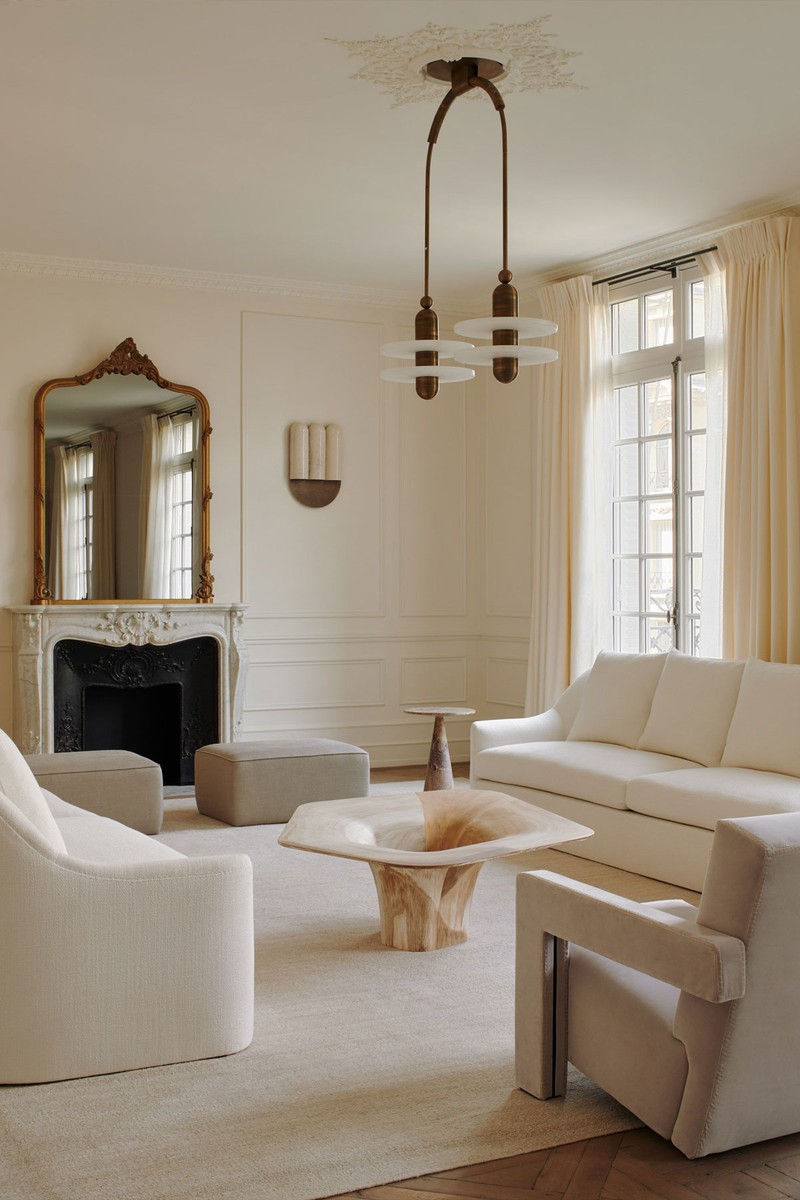
The apartment is approached via a grand hallway with an elegant, curved stairwell. Entry is into a central hallway from which the apartment spreads out on either side. The creamy colour tones on the walls are Farrow & Ball’s Slipper Satin. To the left, the triple-length reception room with its south-facing axis has three sets of original floor-to-ceiling glass doors that open up onto a full-length balcony with views of the Eiffel Tower.
Two custom cream sofas from Atelier Virginie Morel in Holly Hunt fabric sit opposite each other on an oversized silk flatweave rug, complemented by two distinctive, angular Gerrit Thomas Rietveld armchairs upholstered in a creamy Dedar fabric.
Anchoring the room is the eye-catching Dune coffee table by Pietro Franceschini, a smooth sculptural design made in Italy from maple wood. To the other end of this expansive, understated room is the dining area with its bespoke Dolce Vita stone dining table. Set around the table are eight Cantu Alta dining chairs designed by Sergio Rodrigues in the 50s with jacaranda wood and reupholstered leather seating.
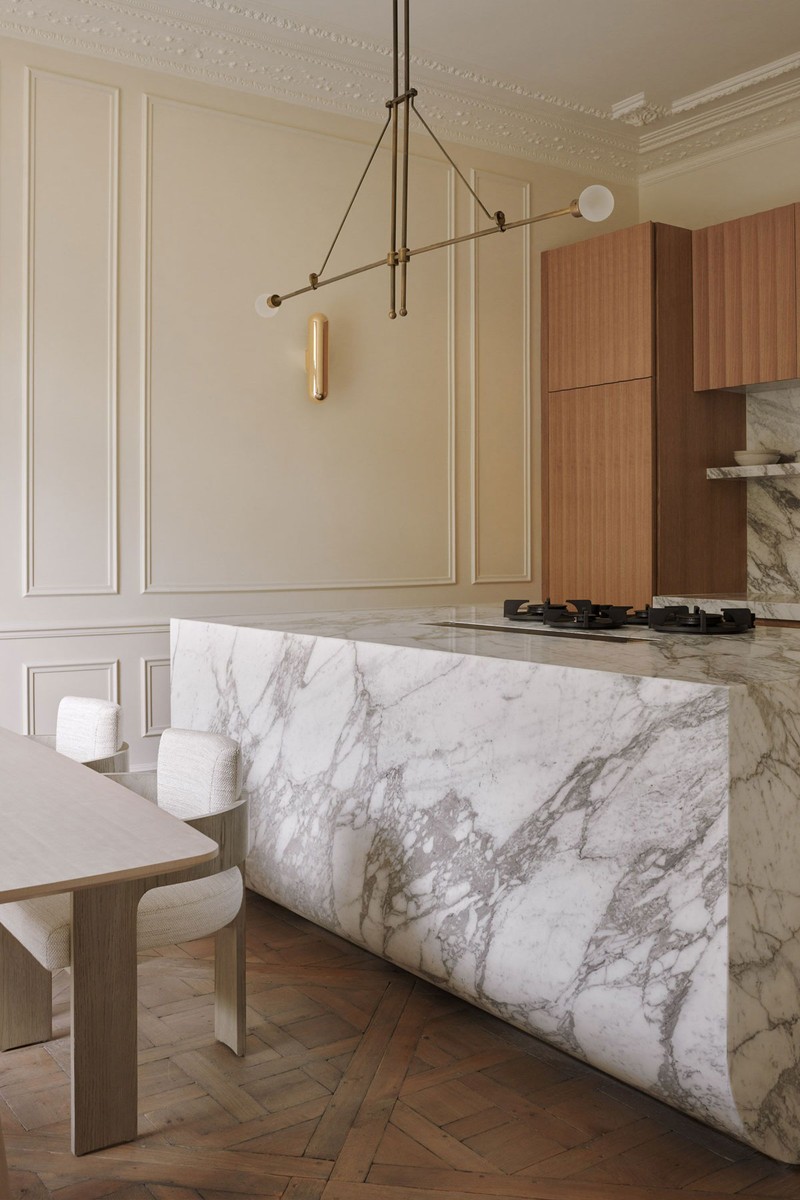
Modern statement lighting in the form of Riloh’s elegant ‘Equil Even’ pendant in August Brass above the dining table is fixed within a custom ceiling rose, designed to offset the original cornicing. A decorative plastered plinth acts as an elegant platform for a vase from Collection Noir. Internal double doors lead through into the kitchen where the statement piece is the kitchen island in Arabescato Vagli with its distinctive base detail. The wooden cabinetry is custom fluted oak veneer designed by Banda Design Studio.
The principal bedroom suite is a calm sanctuary of neutral tones bathed in natural light from its south-facing perspective. The bed features a custom headboard by Banda framed in solid oak and wrapped in a horsehair fabric. Two melange small pendants in bronze with alabaster hang above the Edmond Spence mid-century modern night stands either side in walnut. Banda selected a Kelly Wearstler Esfera Ottoman in a taupe fabric to add a contrasting tone to the colour palette. This versatile piece has fun geometry and bold massing, offering a layer of pattern and texture to an otherwise neutral space. The striking principal bathroom features a bespoke Banda design based off three plinths in Calacatta Viola nestled together. The central plinth houses the marble basin with the two side plinths acting as worktops. The plinths work hard in the compact space with their fully integrated push-catch soft-close drawers clad and vein-matched in the marble. The look is finished with antique brass tapware and Allied Maker Bleached Oak Opal Globe wall lights.
LEINSTER SQUARE, LONDON
As we progressed through the sales journey at Leinster Square – a development of 15 properties behind seven Grade II-listed buildings in Notting Hill – we were keen to hold back this townhouse so we could understand how our residents live in their homes. I mentioned our ‘design for living’ mantra, and what has become apparent here is that the entertaining spaces are at the heart of the home. The spacious kitchen, living and cinema room create a wonderful energy, while serenity can be found in the study and bedroom suites.
The design journey starts immediately in the hallway with a large, impactful piece of art by Tycjan Knut. The artwork with its muted tones beautifully complements the mid-century antique painted glass pendant and the custom 'dug out' console table by Studio 125. The console table was chosen for its deep textured, masculine and somewhat brutalist matt wax finish – this pays homage to the natural Bauwerk 'Quiet' paint colour on the walls on the ground floor, too.
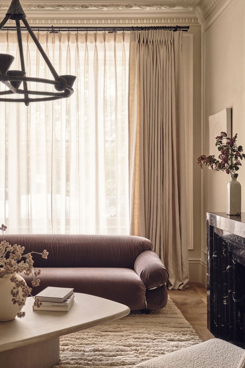
The vintage Sesann sofa, designed by Gianfranco Frattini for Casina and sourced from Belgium, forms the focal point of the living room. To encourage a feeling of 'togetherness' in the living space we also included a Linea Luxe bespoke armchair inspired by Ivan Matusik and a bespoke Dipe Concept coffee table. The squiggle wall light in a bespoke bronze with a parchment shade also draws the eye to create natural-looking shape and texture. While the living area has been designed with entertaining in mind, the flow into the study encourages a feeling of peaceful creativity.
The bespoke desk designed by Banda and made by James McCulloch in smoked figure eucalyptus veneer draws the eye with its rippled texture. This feeling of texture is mirrored in the Ingo Maurer Lampampe table light by Holloways of Ludlow. The lamp, made from Japanese paper with its perfectly imperfect style, is reminiscent of the wabi-sabi design movement. The jute rug by Armadillo & Co in Terra Moss was chosen for its aesthetic as well as its positive social and environmental impact. As with all Banda designs, artwork forms a major part of the wider story telling – we commissioned Matthias Fabre to create the focal piece of art in the study. It’s inspired by ascetic writing, Japanese calligraphy and graffiti tagging.
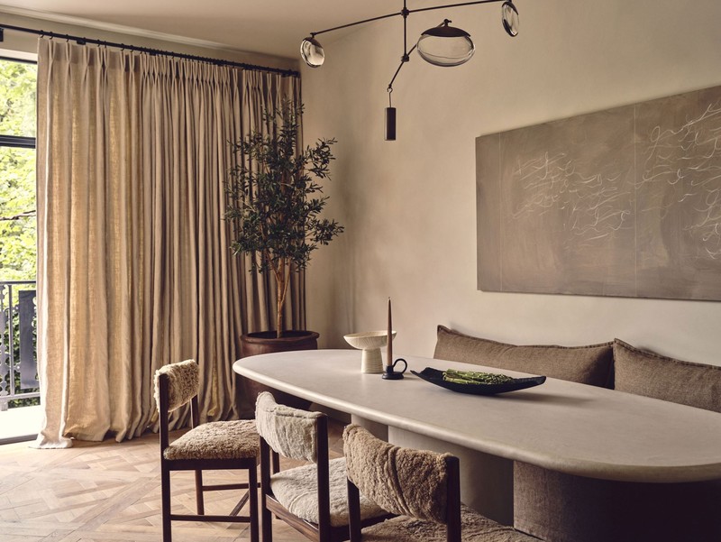
The kitchen is for entertaining, going back to nature, cooking and family time – and the pieces were chosen to reflect this. The four vintage Danish dining chairs upholstered in total recycled sheepskin from Anna Unwin set the tone for wider design. The Gaia pendant from Ochre bounces light around the room and illuminates the statement Dipe Concept custom dining table in a light satin finish. The feeling of comfort is made ever present by the oversized bespoke cushions on the ottoman bench. Moving downstairs the spacious main bedroom suite with its Banda bespoke bed in stained oak and upholstered in Rose Uniacke Heavy Weight Cotton Velvet Mole creates a true design ‘moment’ – the deep colour creates a timeless elegance.
Visit BandaProperty.com
DISCLAIMER: We endeavour to always credit the correct original source of every image we use. If you think a credit may be incorrect, please contact us at info@sheerluxe.com.
/https%3A%2F%2Fsw18.sheerluxe.com%2Fsites%2Fsheerluxe%2Ffiles%2Farticles%2F2023%2F09%2Fsl-ultraluxe-banda-interiors-3.jpg?itok=NxkekdDL)
/https%3A%2F%2Fsw18.sheerluxe.com%2Fsites%2Fsheerluxe%2Ffiles%2Farticles%2F2023%2F09%2Fsl-ultraluxe-banda-interiors-4.jpg?itok=Rc4rUs_k)
/https%3A%2F%2Fsw18.sheerluxe.com%2Fsites%2Fsheerluxe%2Ffiles%2Farticles%2F2023%2F09%2Fnew-full-sl-ultraluxe-banda-interiors-9.jpg?itok=lykPnULT)
/https%3A%2F%2Fsw18.sheerluxe.com%2Fsites%2Fsheerluxe%2Ffiles%2Farticles%2F2023%2F09%2Fsl-ultraluxe-banda-interiors-11.jpg?itok=OGwm0lNO)