A Calm & Considered Home In Belfast
The Property
This family home, for a professional couple and their three children, is in a residential suburb in Belfast – specifically a Conservation Area of special architectural and historic interest. This meant the house was subject to stricter planning laws for any external modifications. Constructed in the early 20th century, the original house is over 120 years old, sited on a raised private plot, and set within high mature trees and hedging.
The three-storey building was originally constructed in red brick, signature of the area, with three pronounced chimneys (all of which had to be taken down and rebuilt), a front bay window with decorative cornicing and timber sash windows. In the 1950s, the house was converted into three flats by the previous owner, spoiling many of the original Victorian features and the layout.
We were tasked with a full renovation including: part demolition; architectural and structural alterations to the building; interior design; and decoration, including sourcing furniture, sculptures and lighting. It was both an architectural and interior design project, with significant structural changes to the building and new layouts on every level.
The Brief
The brief was to restore the building to its original purpose as a family residence, while simultaneously reviving and preserving the few remaining Victorian elements. In parallel, it needed to be adapted for contemporary family living, addressing both the requirements of a young family and the challenges posed by the building’s cramped rooms and dark, damp conditions. This entailed reworking the entire layout on every floor – creating flexible, open living spaces with ample storage, alongside quieter, more private spaces.
It was clear the kitchen was important to our clients, so we made this the focal point of the ground-floor living-dining-kitchen area. We also selected materials that were not only robust enough to withstand the rigours of family life, but also comfortable, with a sense of enduring quality to them.
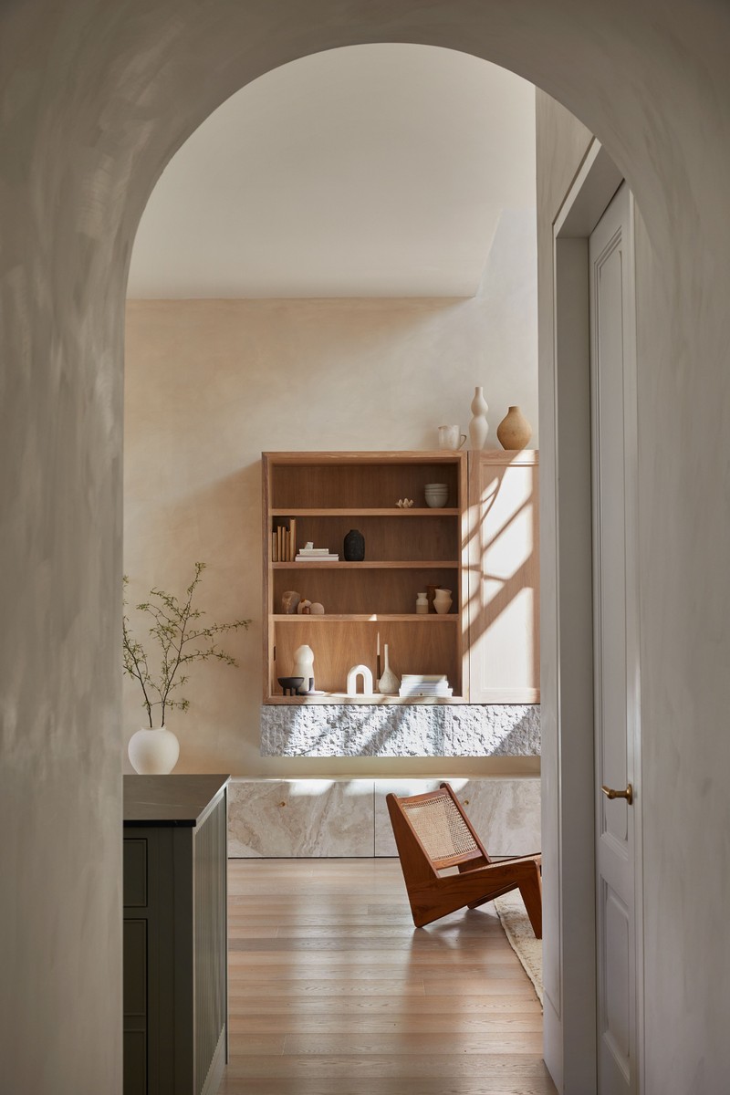
It was also important to enhance the connection with the garden. Passing through a concealed arched door and barrel-vaulted entrance, you step into an expansive double-height living, dining and kitchen area. We strategically positioned this space to offer our clients a sweeping view from the front to the back of the building, providing views of both the new front terrace and rear courtyard garden.
For entry to the rear courtyard garden, we designed large floor-to-ceiling, custom-made sliding timber doors, with timber-framed glazing and a canopy. For the new limestone front terrace, we added French doors and new sash windows to connect the living area to this outdoor space. Practically, the home was stripped and restored with a retiled roof, new sash windows, repointed façades and internal insulation throughout.
The Colours & Materials
We took a consistent and cohesive approach throughout the home, with calming, neutral tones and a simple but textured palette of materials. The natural qualities of the materials juxtapose with bolder touches throughout the furnishings, decorative objects, sculptures and artwork. To create a sense of calm and relaxation, we used Bauwerk’s textured lime paint colours ‘Bone’ and ‘Stone’, both of which were chosen for their texture and depth, and how the subtle brushstroke variations caught the light.
Textured marble and natural stone filters through the home in custom-designed joinery such as crafted vanities and fireplaces – the Rosa Antico, Crema Diana and Viola marbles work well against the more minimal brassware. Upstairs, in the kids’ bedrooms and shower room, we used more refreshing pinks and blues, as well as sage green tiles.
The natural oak flooring on the ground floor was sourced from local supplier Trunk. On the upper floors, we restored the original Victorian floorboards, before treating them with an off-white natural oil to enhance their character.
The design is a delicate mix of softer touches and classic modern styles, balancing contemporary Scandinavian minimalism with traditional elements and signature furniture pieces to elevate the space.
Finally, we took great care in sourcing and curating a diverse and bold selection of art, sculptures and furnishings. We sourced from local and international artisans, styling everything with iconic pieces of the past and contemporary pieces of today.
TAKE THE TOUR
The Entrance Hallway & Stair
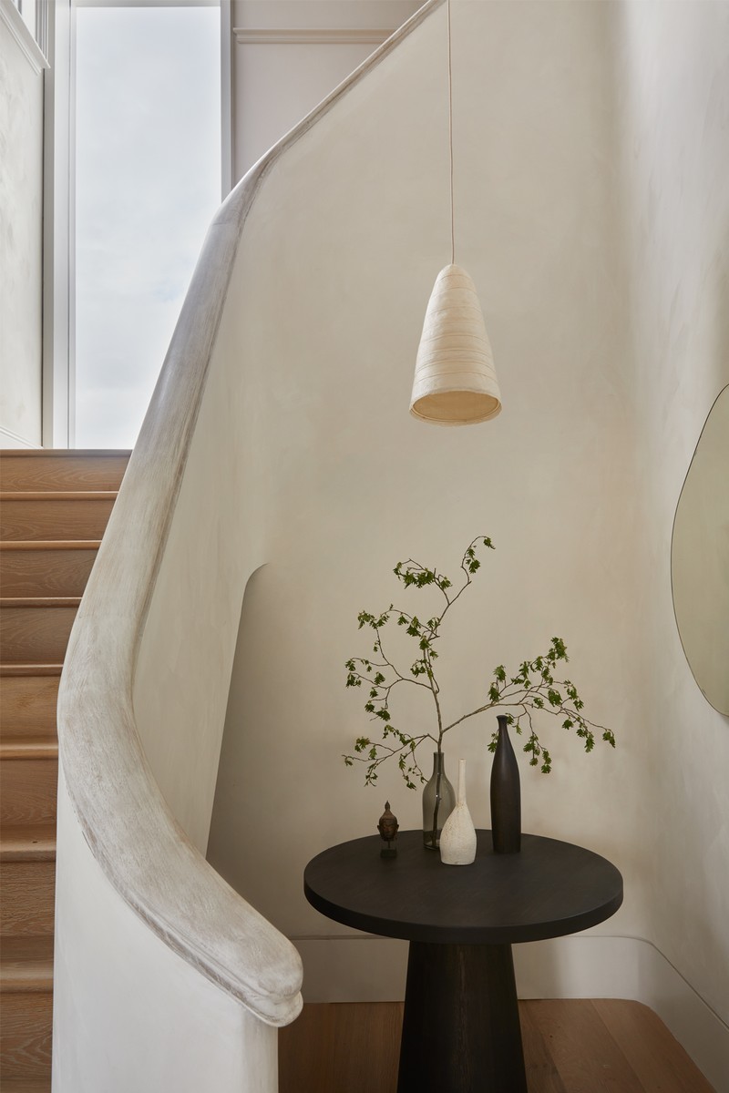
We split the staircase, repositioning it at opposite sides of the building's plan (a new stair replaced the dilapidated central stair through the building). We added a new full-height window to the landing, which highlights the subtle textures of the Bauwerk lime-painted walls and staircase.
FLOORING & STAIRS: Trunk
WALLS: Bauwerk
PENDANTS: Pinch
TABLE: Edward Collinson
The Living Area
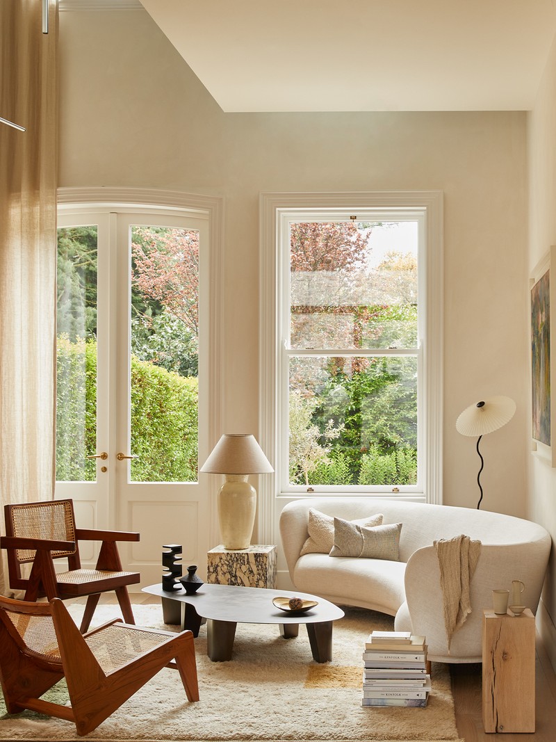
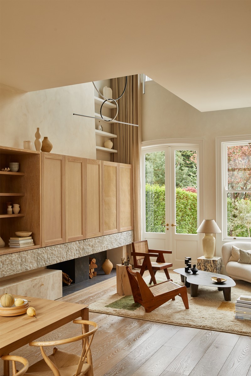
This new double-height space is accessed from a new barrel vault corridor and secret arched door. Set at the same level as the surrounding mature trees, natural light pours in from the south through new sash windows over two floors and a flowing 7m-high curtain made of natural linen. This results in a naturally illuminated, two-level living space, accentuated by a bespoke natural stone fireplace and the play of light on the textured Bauwerk walls.
This double-height living area is a dynamic space, rich in texture, comfort and warmth. We concealed the TV within a bespoke, cantilevered oak cabinet, over a limestone mantle we designed. It has the ideal mix of high and low-level light for a dynamic living environment
FLOORING: Trunk
HEARTH STONE: Supplied by Porter
PAINT: Bauwerk
RUG: Beni Rugs
VIOLA MARBLE PLINTHS/SIDE TABLE: Porter
PENDANT LIGHTING: Michael Anastassiades
FLOOR LAMPS: Oscar Piccolo & GUBI
TABLE: Vogel Studio via The House by Mah
CHAIRS: Vintage Pierre Jeanneret
DANDY SOFA: Mass Productions
CERAMICS: The House by Mah
CURTAINS: Stitches by Cheryl
The Kitchen & Dining Area
We positioned the kitchen to offer our clients a sweeping view from the front to the back of the building. The client wanted an island and dining space for entertaining and family meals, with the pantry tucked away for meal prep.
KITCHEN: Porter & Jones
TABLE: EthniCraft Table
PENDANT LIGHT: GUBI
CHAIR: Vintage Gehry Wiggle
CERAMICS: Nom Living
The Snug
This is a brightly lit space in which to relax, with new floor-to-ceiling timber-framed glazing, terracotta flooring and a visual connection to the new rear courtyard garden.
SOFA: Ligne Roset
COFFEE TABLE: Nor11 Le Roi coffee table from Bound Concept
RUGS: Cappelen Diymr
The Sitting Room
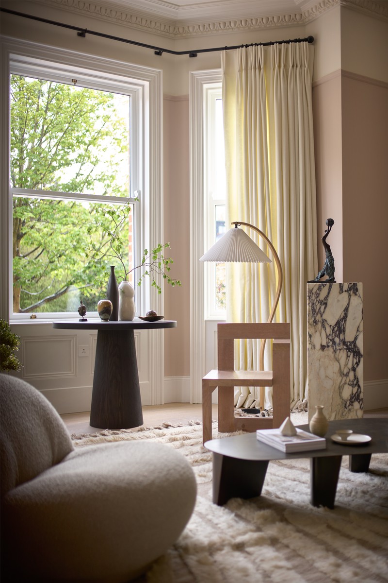
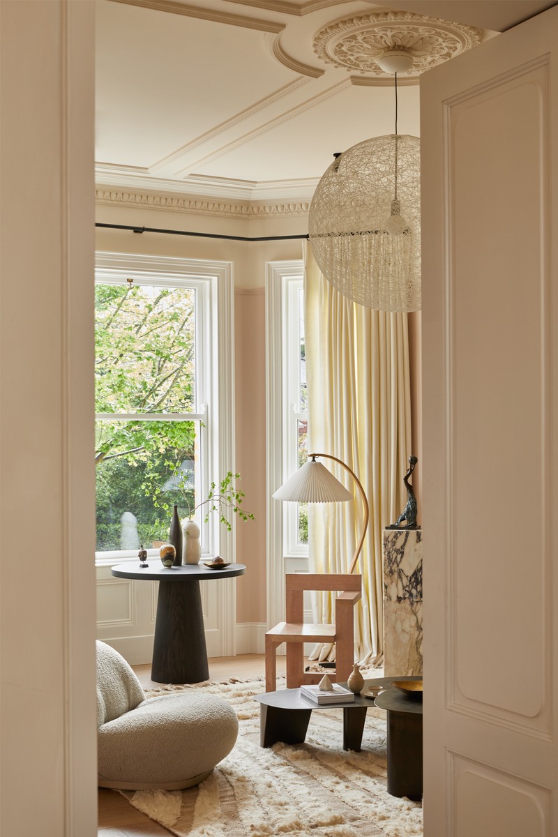
In one of the few rooms in the house where we didn’t take down walls, we restored the Victorian cornicing and ceiling details, adding bolder pieces of furniture to contrast with other rooms in the home. It’s a place for quiet and calm, concealed behind tall panelled double doors with subtle curved details.
RUG: Cappelen Diymr
TABLE: Edward Collinson
CHAIR: David Horan from Beton Brut
VINTAGE STELTMAN CHAIR: By Gerrit Rietveld
VIOLA MARBLE PLINTHS MADE BY: Porter
CERAMIC WALL SCULPTURE: Derek Wilson
MARBLE FIREPLACE: Ryan & Smith
WALL ART: Louis Le Brocquy & Hector Mcdonell from James Wray & Co gallery
FLOOR LAMP: GUBI
WOODEN SCULPTURES: Jamie Gaunt
The Study
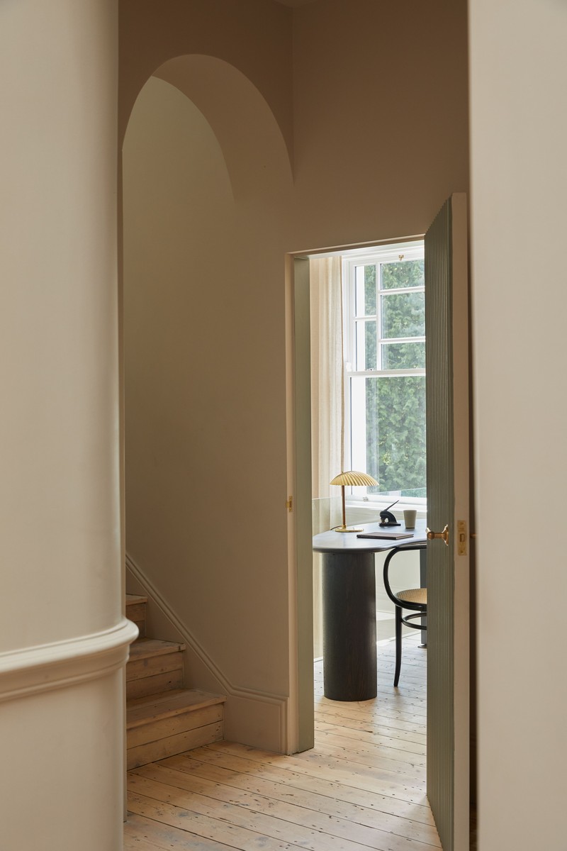
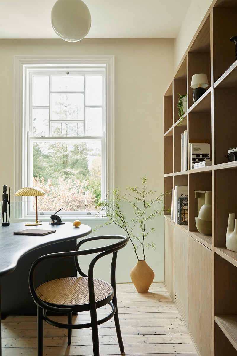
A new cantilevered floor forms the home office with a clear glass balustrade. We added Fred Rigby’s Kidney desk, a beautiful piece of crafted joinery with its dark ebonised finish, alongside custom stained-oak joinery and shelving.
SUSPENDED CEILING LIGHT: Michael Anastassiades
DESK & FLOOR LAMP: GUBI
DESK CHAIR: Vintage Thonet
CERAMICS: MAH Gallery & Derek Wilson
The Main Bedroom
Accessed via custom panelled double doors with curved details, we added a barrel vault ceiling to frame the entrance to the main bedroom. It’s a bright and welcoming space, with the original natural floorboards left exposed, and natural linens added for comfort.
BED LINENS: By Molle
BENCH: Norr11 Le Roi from Bound Concept
CERAMIC VESSEL: Derek Wilson
WINDOW DRESSINGS: Stitches by Cheryl
The En-Suite
Discreet paint and tile lines subtly reference Victorian features like the dado and picture rail. We wanted a statement crafted bathroom vanity, with the minimal brassware acting as a visual and clean contrast to the beautiful marble vein. The en-suite is hidden behind a secret timber door from the new dressing room, and a freestanding bath is a focal point for the room.
BATHROOM VANITY: Designed by HUTCH from Rosa Antico marble, crafted by Porter
BRASSWARE: Hansgrohe
FREESTANDING BATH: Victoria & Albert
CERAMICS: MAH Gallery
WALL PAINT: ColourTrend
The First Floor Landing
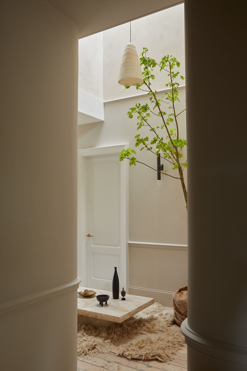
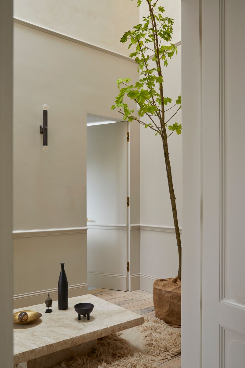
With discreet Victorian dado and picture rails, painted-in skirtings, and a secret door leading through to the kids’ shower room, this is a new central double-height space through which you can access the bedrooms, which we styled with a low marble table and indoor tree to provide drama and interest.
PENDANTS: Pinch
RUGS: Cappelen Diymr
WALL LIGHT: Mathew Cox
BRASS BOWLS: Tom Dixon
MARBLE TABLE: Designed by HUTCH, crafted by Porter
WOODEN SCULPTURE: Jamie Gaunt
The Kids’ Shower Room
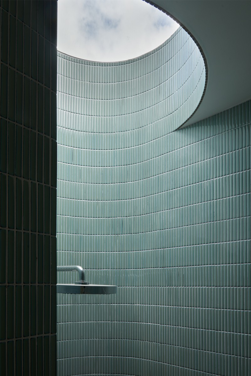
Accessed via a secret door, this is a new space in the home. It’s been tiled throughout from floor to ceiling. The green matchstick tiles add rhythm to the newly curved walls, creating both a welcoming and private bathroom. The shower area is beautifully lit from above with a new circular roof light.
The Children’s Bedrooms
For a playful transition, we opened up the ceilings to increase the feeling of space and height, and added a new ladder opening to a reading mezzanine space. There, we used soft cushions and colours to create a calm place where children can relax.
ARMCHAIR: Faye Toogood from Maven
FLOOR LAMP: GUBI
WALL & CEILING PAINTS: ColourTrend
BEDLINEN: By Molle
STOOL: Jasper Morrison
The Landing Desk Area
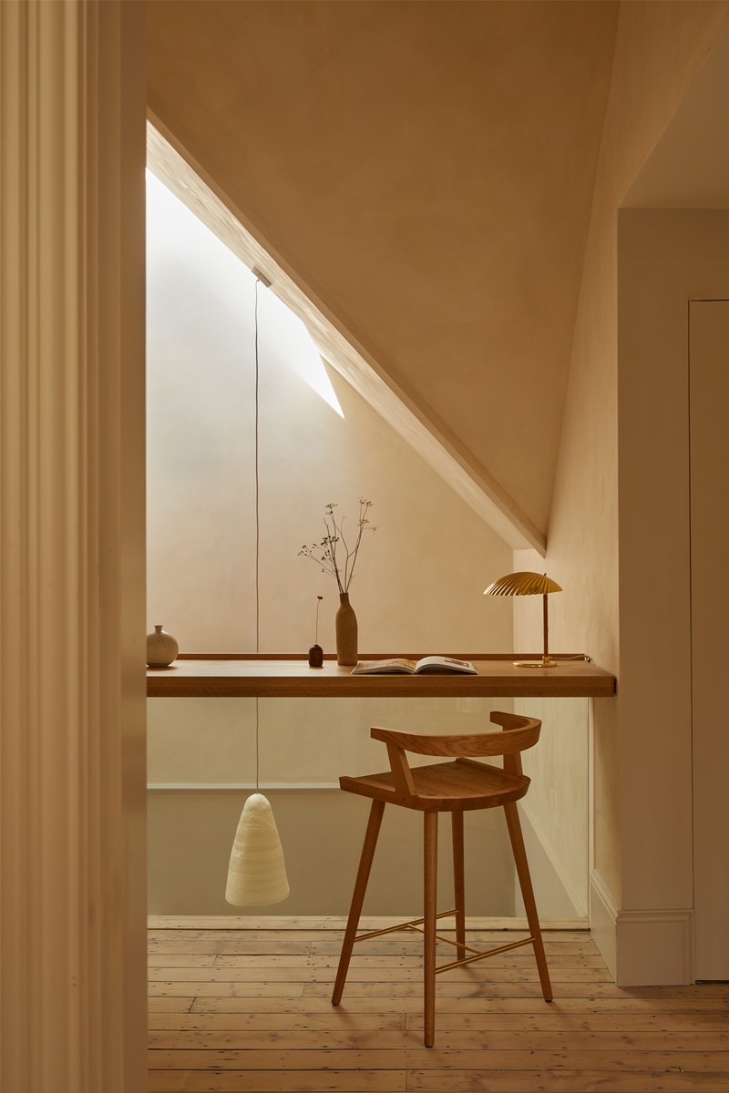
By removing the flat ceilings and adding an angled skylight, we were able to bring so much sunlight down through the house to create a dramatic space split over two levels. This dramatic quality of natural light allowed us to add a flexible space to the landing, which can be used as a desk area, a display shelf or a place to chill. The natural daylight highlights all the textures of the Bauwerk lime paint, and the long natural pendant from Pinch accentuates the height.
Architecture & Interior Design: HUTCHDesign.co, @Hutch.Design
Photographer: HelenCathcart.com, @HelenCathcart
Videography: WilsonArcherFilms.co.uk
Styling: SarahBirks.com, @SEBirks
DISCLAIMER: We endeavour to always credit the correct original source of every image we use. If you think a credit may be incorrect, please contact us at info@sheerluxe.com.
/https%3A%2F%2Fsw18.sheerluxe.com%2Fsites%2Fsheerluxe%2Ffiles%2Farticles%2F2024%2F03%2F4-sitting-room-landscape_0.png?itok=IUoh-lX1)
/https%3A%2F%2Fsw18.sheerluxe.com%2Fsites%2Fsheerluxe%2Ffiles%2Farticles%2F2024%2F03%2F8-kitchen-dining-space-full-bleed.png?itok=_onYjFbH)
/https%3A%2F%2Fsw18.sheerluxe.com%2Fsites%2Fsheerluxe%2Ffiles%2Farticles%2F2024%2F03%2Fhutch-design-house-tour-new-2.png?itok=fcmOuzyh)
/https%3A%2F%2Fsw18.sheerluxe.com%2Fsites%2Fsheerluxe%2Ffiles%2Farticles%2F2024%2F03%2Fhutch-design-house-tour-new-3.png?itok=KXau3VZ6)
/https%3A%2F%2Fsw18.sheerluxe.com%2Fsites%2Fsheerluxe%2Ffiles%2Farticles%2F2024%2F03%2Fhutch-design-house-tour-new-5.png?itok=Bo5mk-5_)
