Interior Designers Share Their Entrance Hall Dos & Don’ts
Jennifer Hamilton,
Director at The Vawdrey House, says…
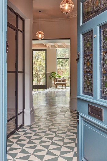
DO use tiles in a hallway. They can help to define it as a practical part of the home, and make it look different from the rest of the house. Tiles work well with underfloor heating and are easy to keep clean but do be mindful of encaustic tiles which are less hardwearing and need additional maintenance. If not looked after properly, encaustic tiles can stain and look dirty, which will spoil the overall look.
DO try to create a sense of space. That way you can improve the flow within the home. Several little tricks can help, including adding an inlayed doormat that’s at least 900mm deep running the full length of the hallway. It’s also best to keep furniture off the floor. If it’s unavoidable, use the depths of the doorways to minimise the impact or, better yet, opt for floating or wall hung furniture.
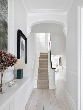
DO add a large mirror to bounce light around the room. This will also make it appear larger, as well as anchoring furniture. They’re also helpful for that quick outfit check before you leave the house. Use a slim shelf below a mirror to store phones, mail and your keys.
DO plan for storage. But you also have to be realistic. Look at your hallway and where things gather. If there are currently a pile of shoes by the door, then it’s clear shoe storage is needed in this area. The same goes for piles of junk mail collecting on the bottom step or the pile of coats hung on the banister. Try to minimise what you keep in your hallway to the items that are used daily. Expect to tidy the area regularly, and rotate items not just seasonally, but throughout the week.
DON’T forget about the rooms beyond. If you have the luxury of planning your hallway from scratch, work with your architect to create sightlines which offer a glimpse into another area of the home. One through to the garden will offer maximum impact and try to avoid a front door that opens into a living space. Always add some sort of barrier between the hallway and the rest of the living room, even if it’s just a screen or object of furniture to help demark the different spaces.
DON’T paint a narrow hallway white. All that ends up happening is that the walls scuff from passing traffic, which draws attention to the tight space and gives the impression that the rest of the home will be scruffy too.
DON’T use downlights. Recessed spots are too harsh and tend to glare, whereas a pendant will give the hallway its own personality and make the space feel like another room within the home. Put the pendant on a dimmer switch too, so that at night you can offer a warmer arrival to your dinner guests.
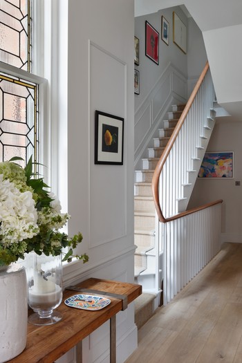
DON’T go for a gallery wall – they look fussy and make the space seem smaller. If you don’t want to use a mirror but still want to add interest to the walls, a single larger print or painting tends to be a better option.
Claire Sa,
Director at De Rosee Sa, says…
DO paint the hallway a darker colour. It can be tempting to paint a north-facing hallway in white to brighten it, but often the reverse works best.
DO control the lighting carefully. Try to make the area bright and airy during the day but with the option for more mellow lighting in the evening. You want to be seduced into a house through the hallway and eased out after an evening of fun. If you can have a fireplace in a large hallway, this can create a really luxurious ambience. Only use ceiling spots if they are casting light over artwork and don’t have large ceiling pendants or chandeliers unless your hallway is quite grand. You don’t want to over light a hallway, especially not with cold lightbulbs; otherwise it can feel like an airport lounge.
DO add larger paintings and artwork. An anonymous hallway always looks sad. Even if your hallway is narrow, a skinny console table with some thin stalk lamps will liven up the space. Sometimes a simple bench or a pair of chairs and a mirror above is enough.
DO squeeze in as much hidden storage as possible – especially if you have children. Use spaces under staircases or thicken out the walls to create coat cupboards. Baskets work well tucked under benches, or add drawers under in-built benches to hide shoes, hats and gloves. I wouldn’t make a display of shoes and coats, or even bikes – they don’t really enhance a hallway, so try to work in hidden storage as much as possible.
DON’T be afraid to switch up the floor surface. Transition from a stone or more hardwearing floor to a wood floor if you have the space. Sometimes a change in floor surface can help give a hallway a stronger identity and interest.
DON’T add too many obstacles. Hallways are often gathering points for guests who are arriving or leaving a house, so it’s important to create as much space and freedom of movement as possible.
DON’T forget different people’s needs. Make it easy and accessible for children to hang up their coats and schoolbags (that means low hooks or easy access drawers ) while large coir mats, running wall to wall, are cheap and can be a very practical flooring surface for families with pets.
Visit TheVawdreyHouse.com & DeRoseeSa.com
DISCLAIMER: We endeavour to always credit the correct original source of every image we use. If you think a credit may be incorrect, please contact us at info@sheerluxe.com.


